
CONCEPT
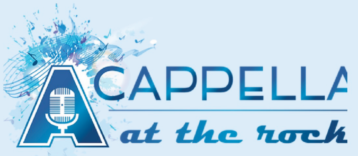
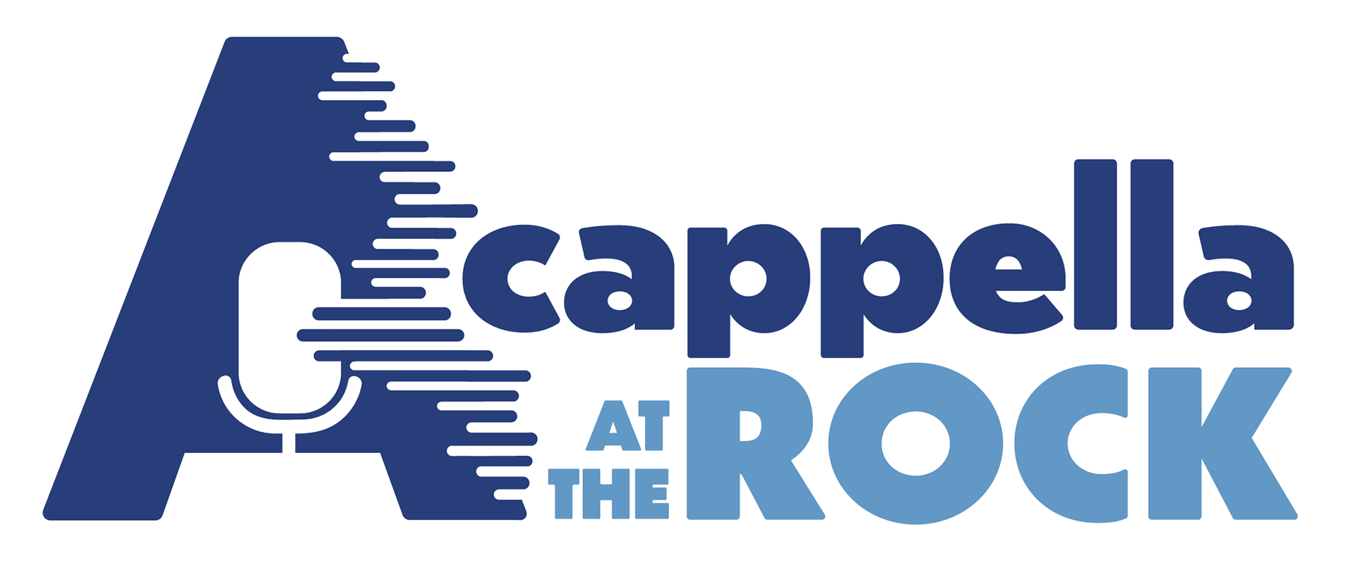
The client wanted the same feel from the original logo. They wanted the giant A with the microphone and said that they needed the logo to be able to have the same arrangements. While I kept their iconic A with the microphone I simplified and modernized it as well as added sound waves that act as the bars of the microphone and run up and down the side of the A. This idea was inspired by a cappella music and how it's based exclusively on the raw element of voices. This branding is very flexible and other iterations include subtle music staffs around the the icon.
ORIGINAL DESIGN:
