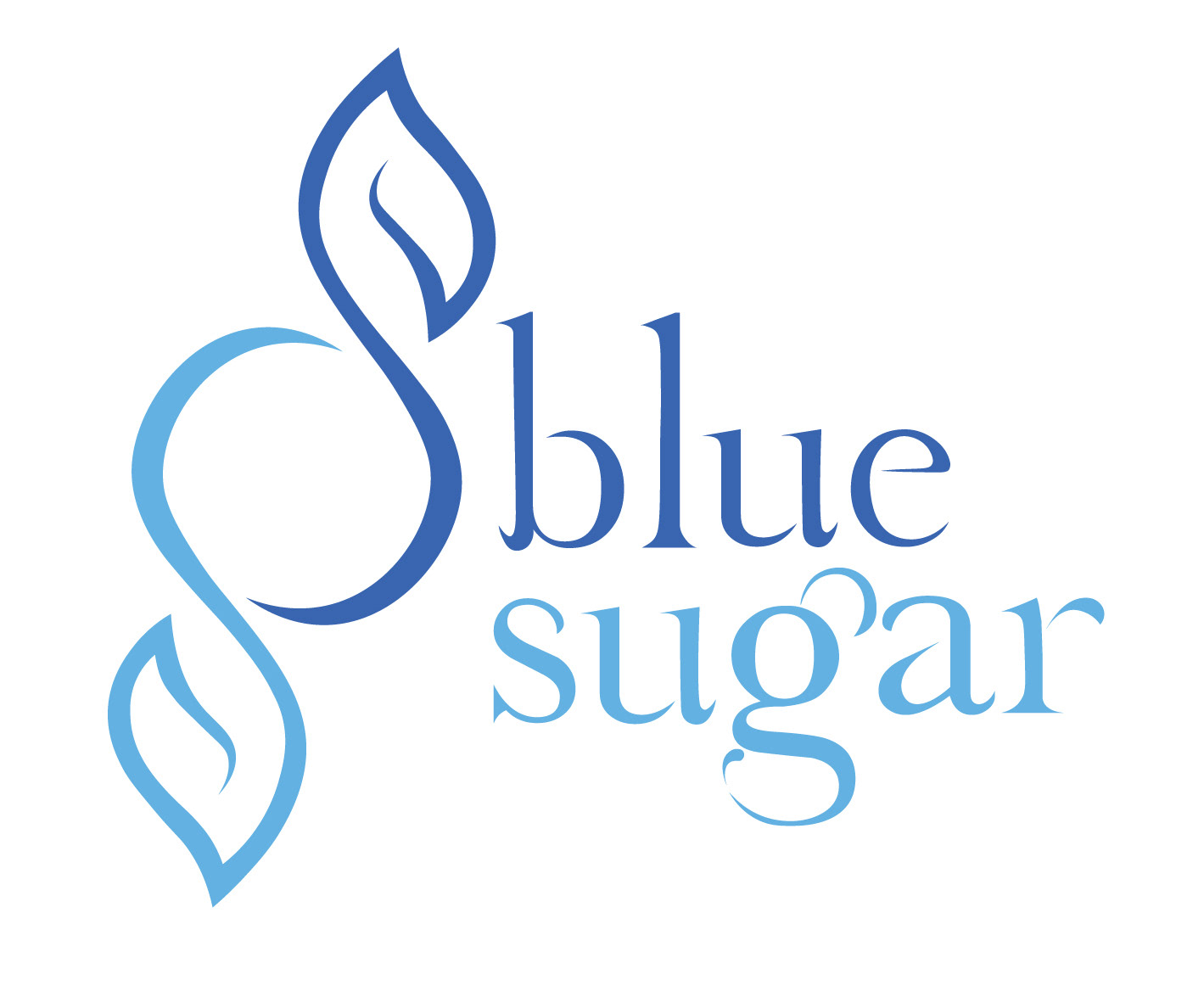
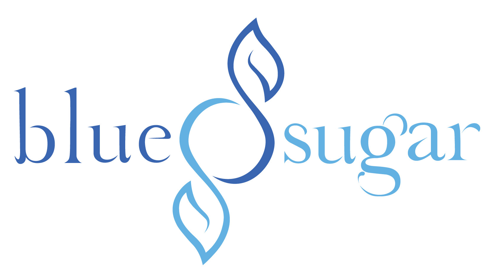
LOGO
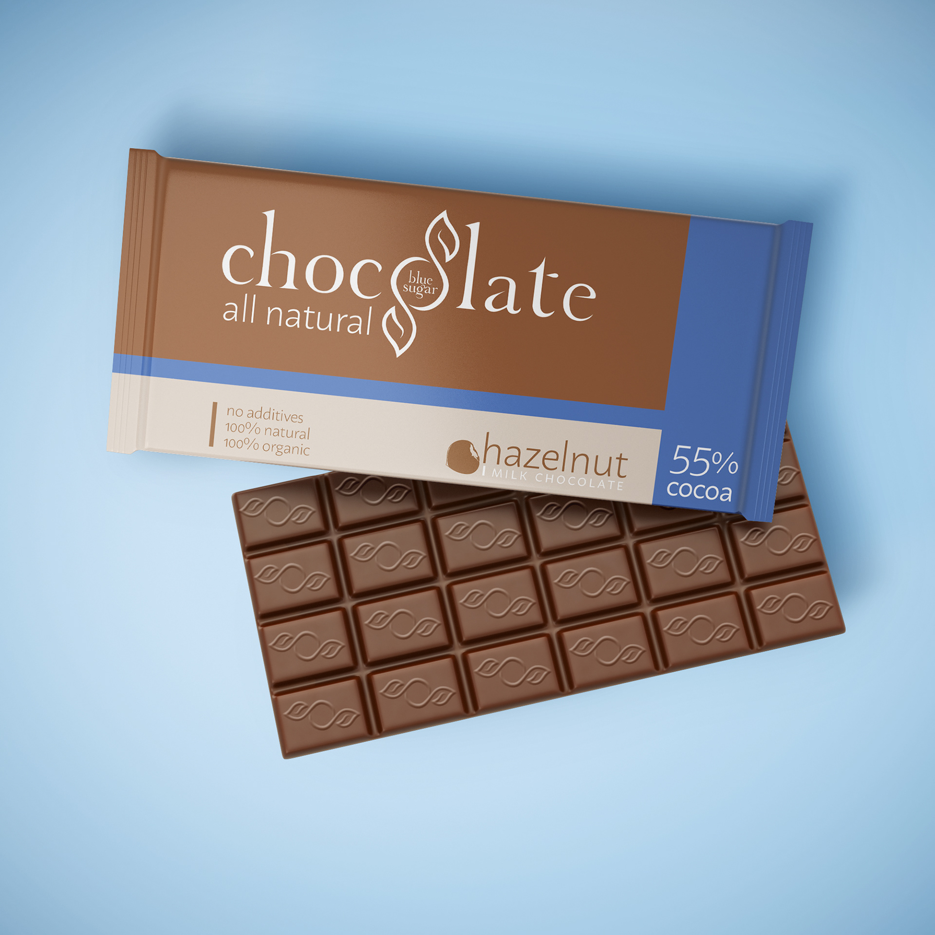
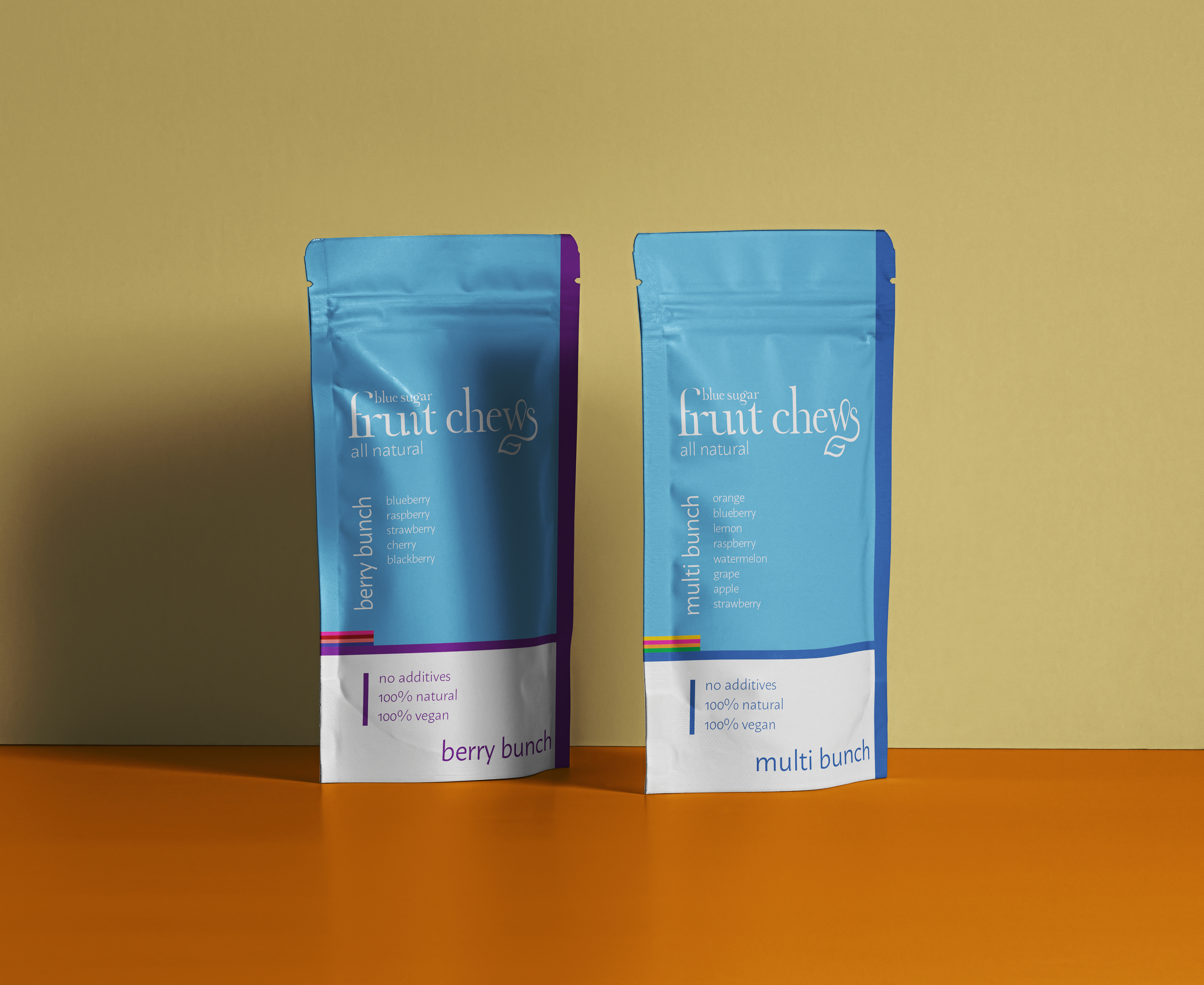
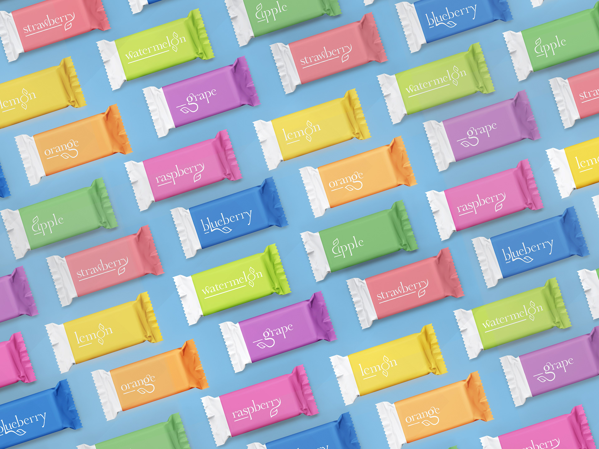
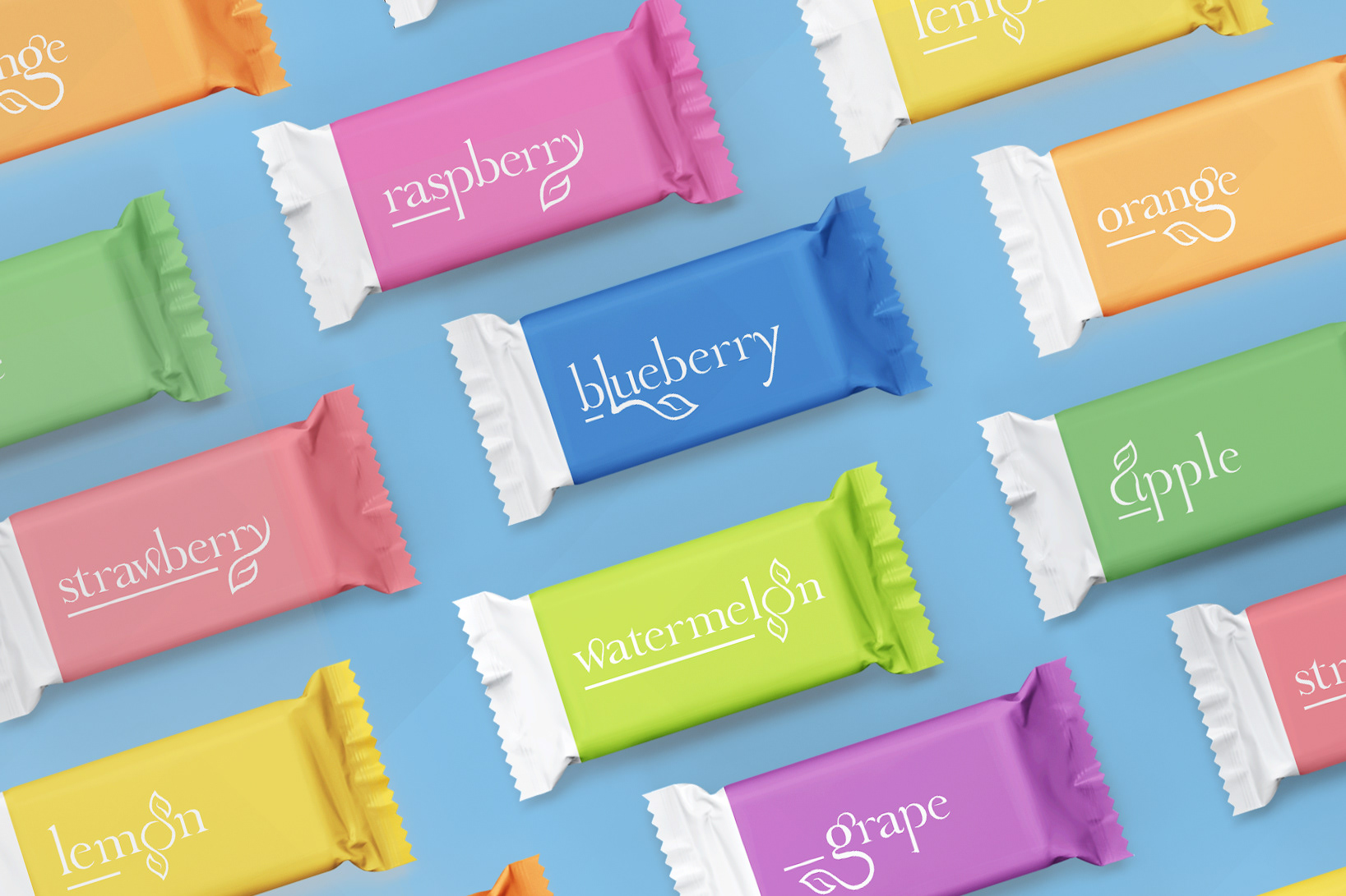
Blue symbolizes the honest natural ideals and ingredients of the company. The candy's ties are leaves, indicating the very natural ideals and ingredients the company incorporates in its products. The organic leaf element is incorporated into the typography of the packaging in different ways.

PACKAGING
The packaging is clean and crisp, emphasizing the companies natural ideals. Each product includes the leaf of the logomark within the typography. The simplicity of the layout allows the leaf to be the focus of each product.