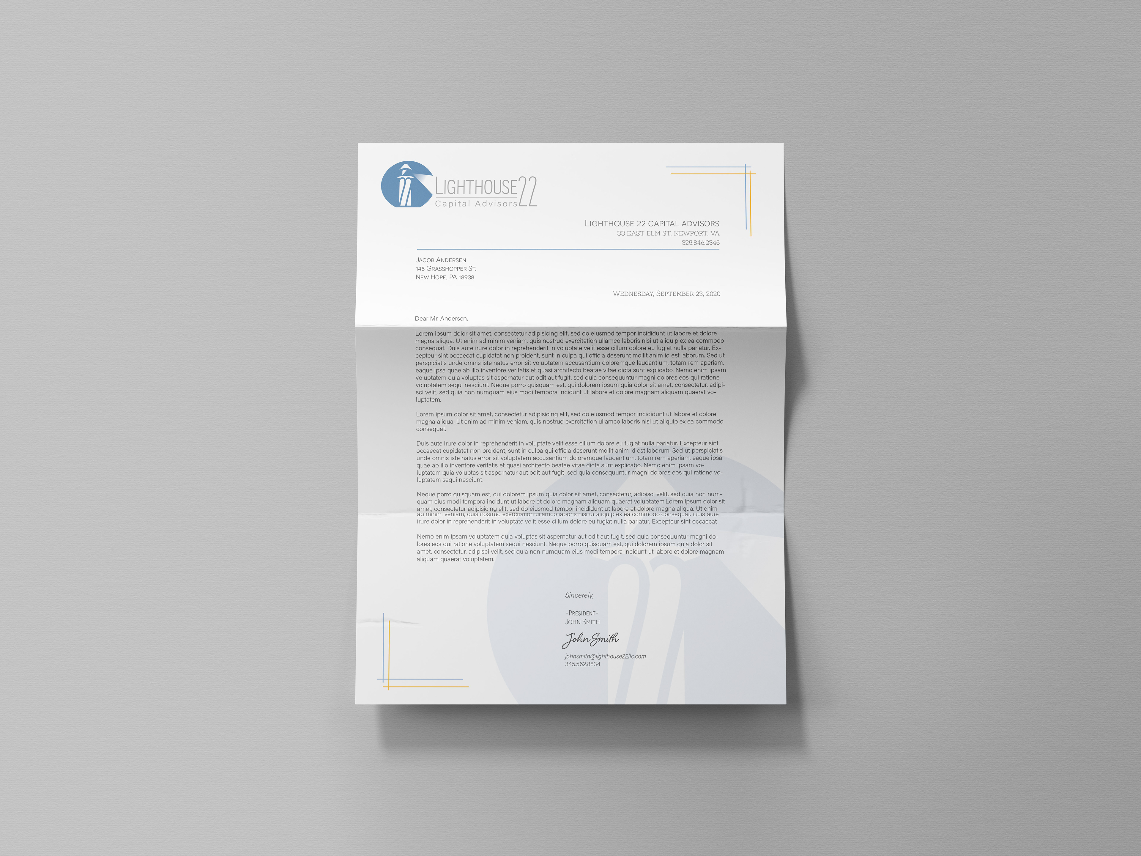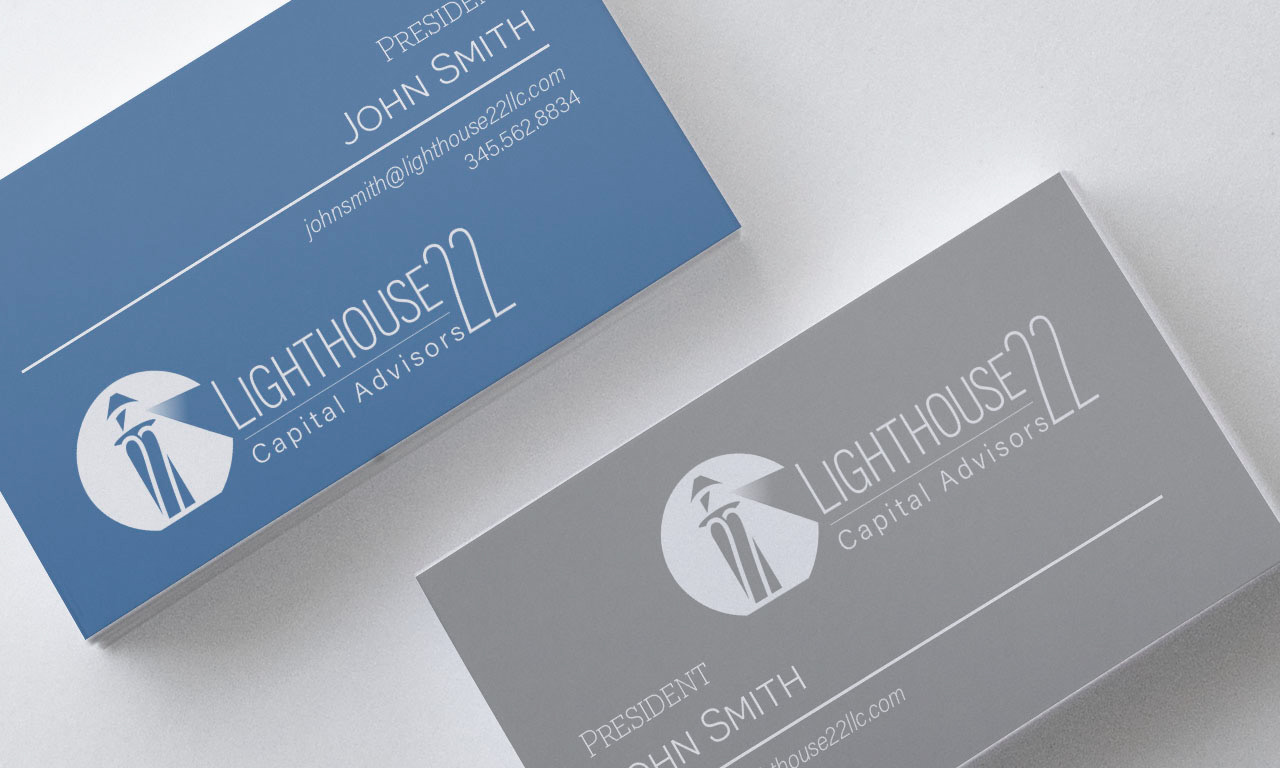
In May of 2020, Lighthouse 22, a financial advisement and investment company, reached out to me in need of a versatile logo. Their name "Lighthouse 22" represents their guidance of startup companies. They wanted a clean, modern, sophisticated design that would be flexible on a variety of colors and in various orientations.

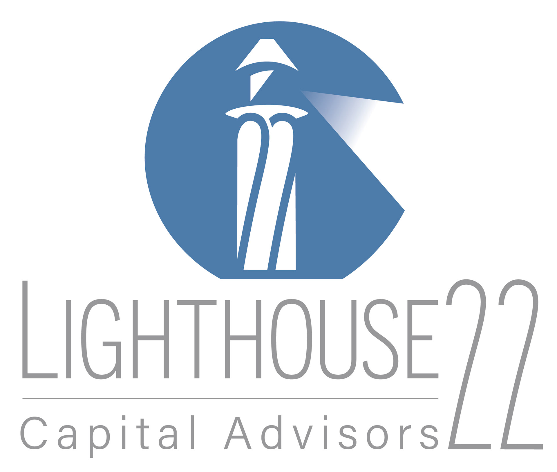
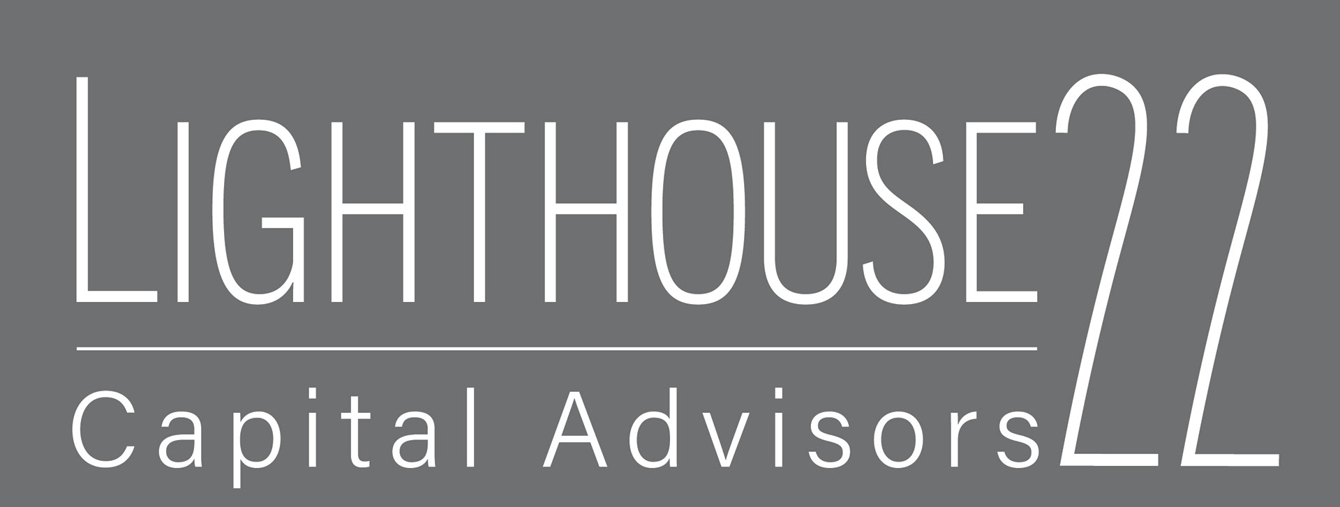

MY VISION (left)
My vision for the design included 2 beams of light. I felt the symmetrical aspect of the lighthouse and the 22 were better emphasized with the two beams. The use of small caps for "Capital Advisors" allowed a clean baseline to line up perfectly with the "22".
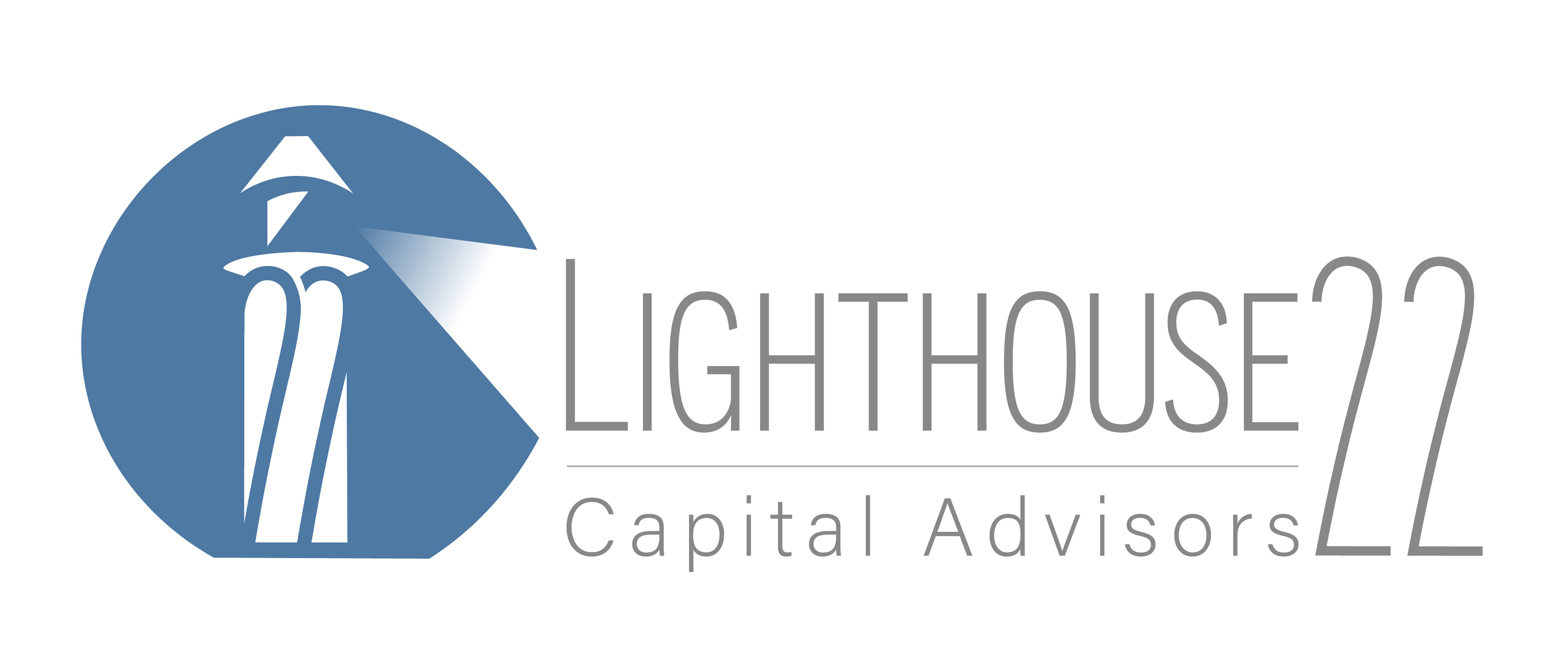
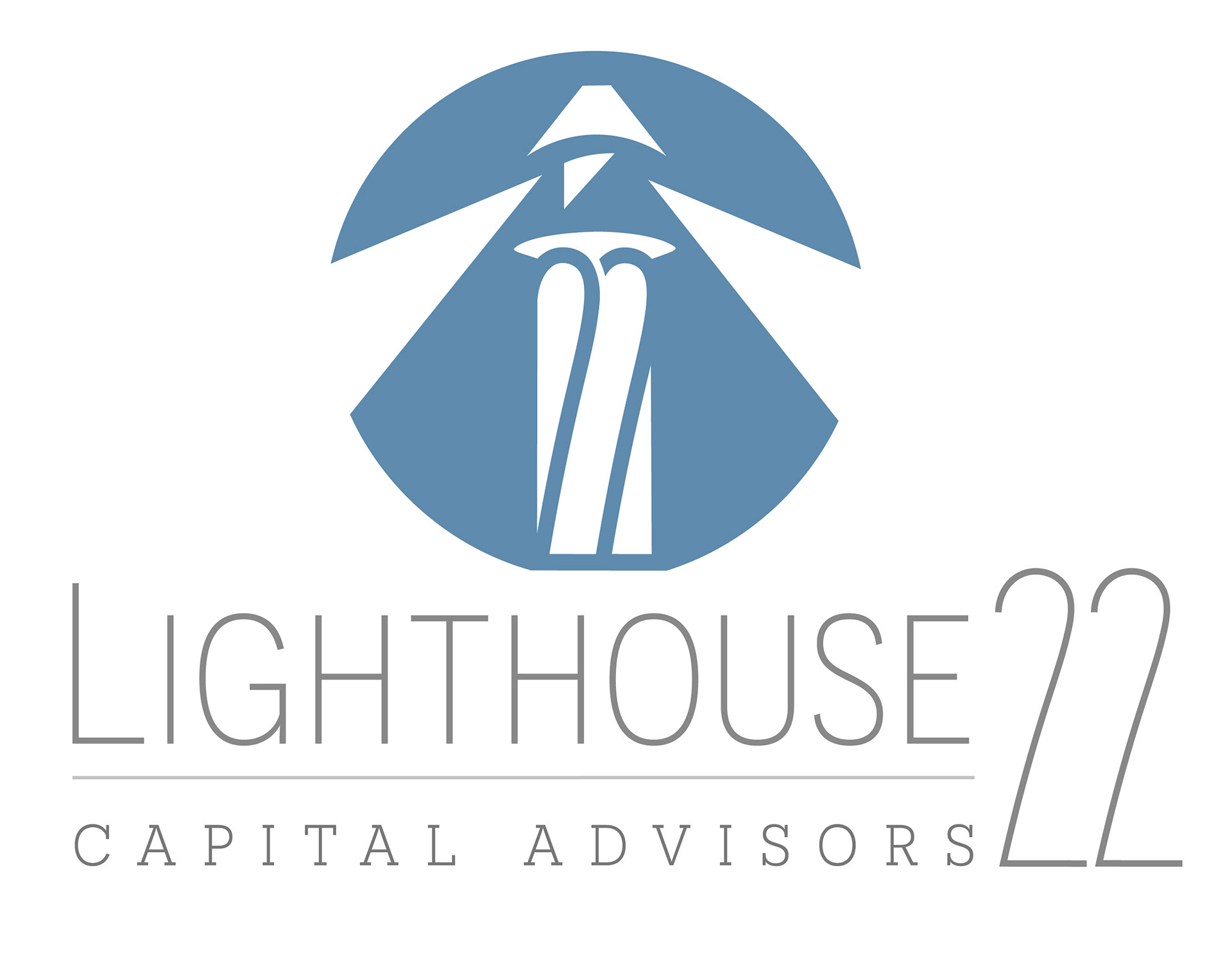
THEIR VISION (right)
Lighthouse 22 felt that one beam of light more accurately represents who they are as a company and the guiding light they are for their clients. The gradient beam was important to them as they wanted the logo to more literally depict a beam of light.
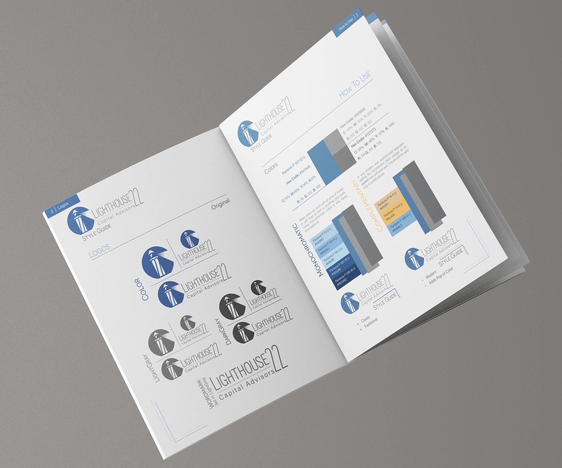
STYLE GUIDE
The style guide was catered specifically to Lighthouse 22 and acts as a concise guide covering the basics of how and when to use the logos. It informs when to use which logo and how, as well as future color schemes they may want to try, "do's and don't's", and what typefaces will work well with their logos.