CONCEPT
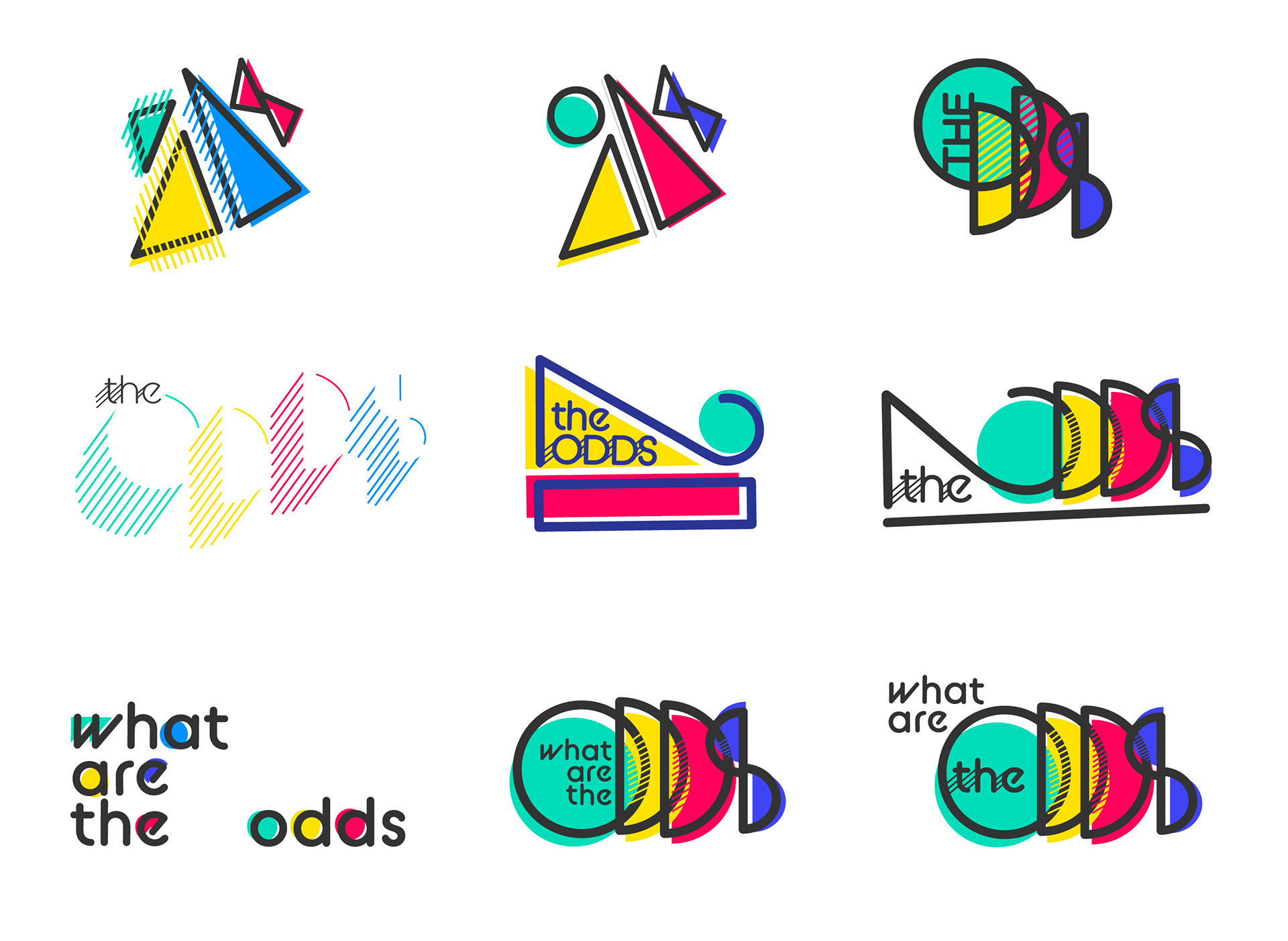
The theme of "the odds" is symbolic of our class and the unique journeys we have all had to find graphic design as our passion. This concept incorporates multiple themes in the style of offset shapes, including the year of our graduation, as well as triangles. This branding was created in collaboration with 4 other students in the show. Other student teams were responsible for the creation of the website, social media and fundraising.
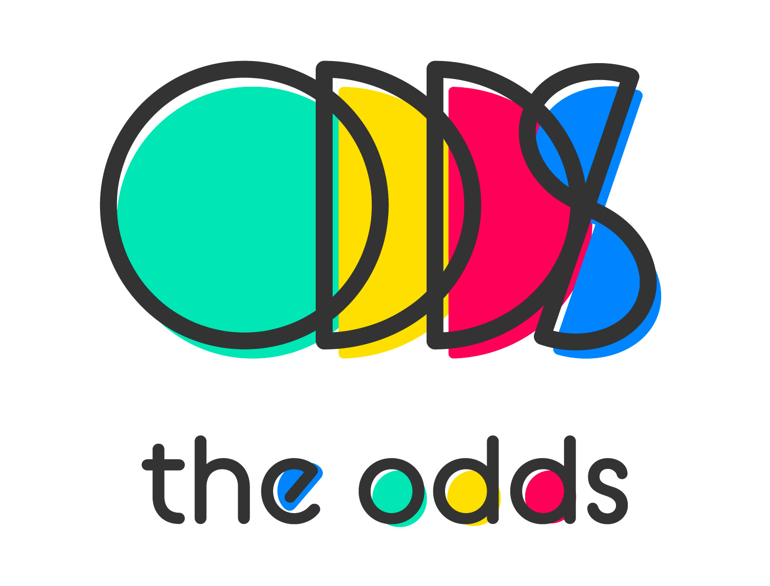
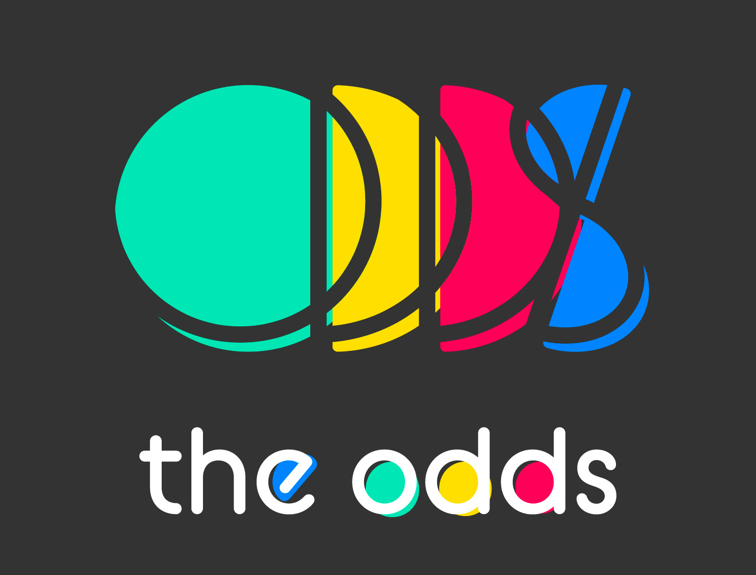
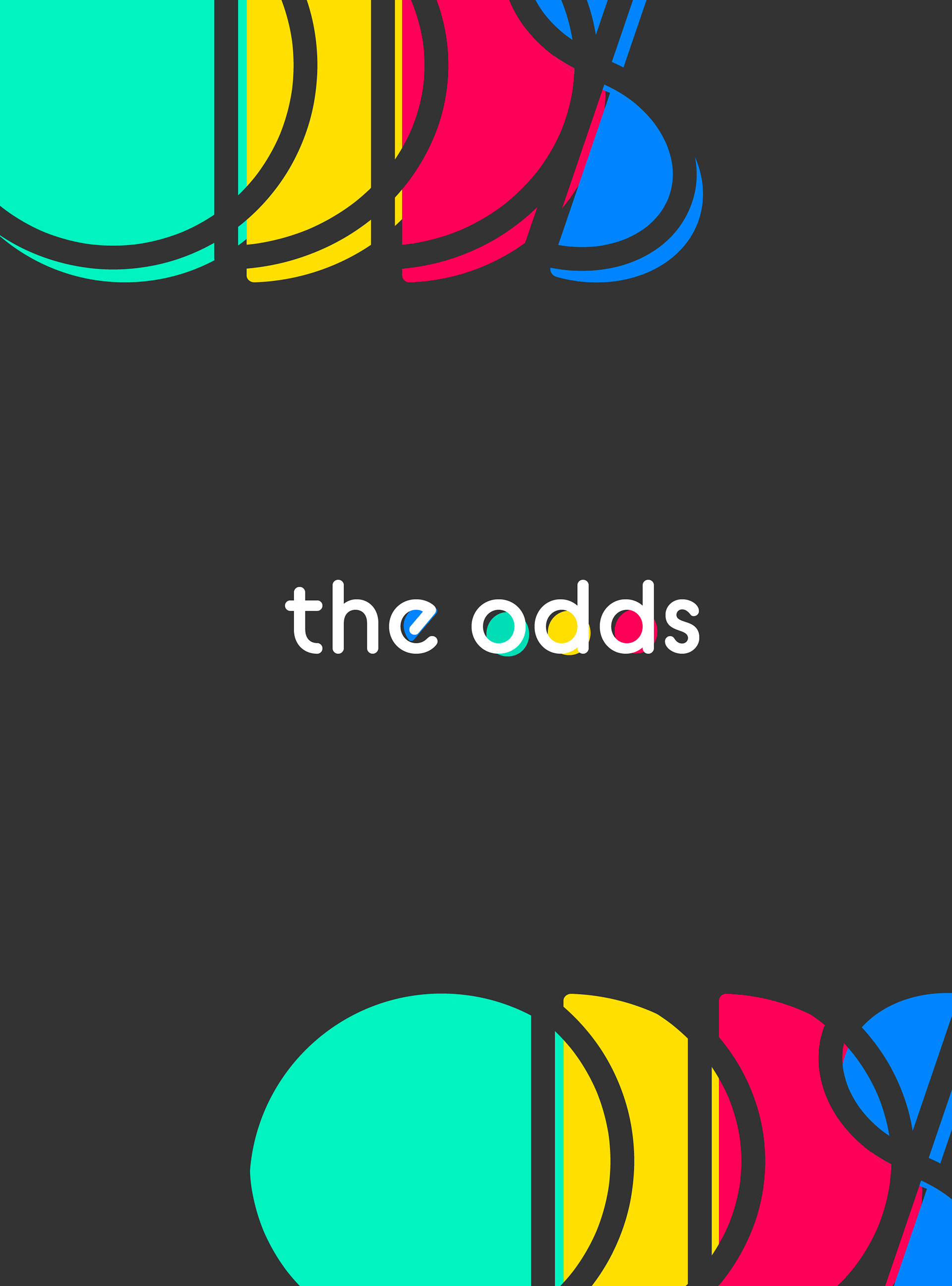
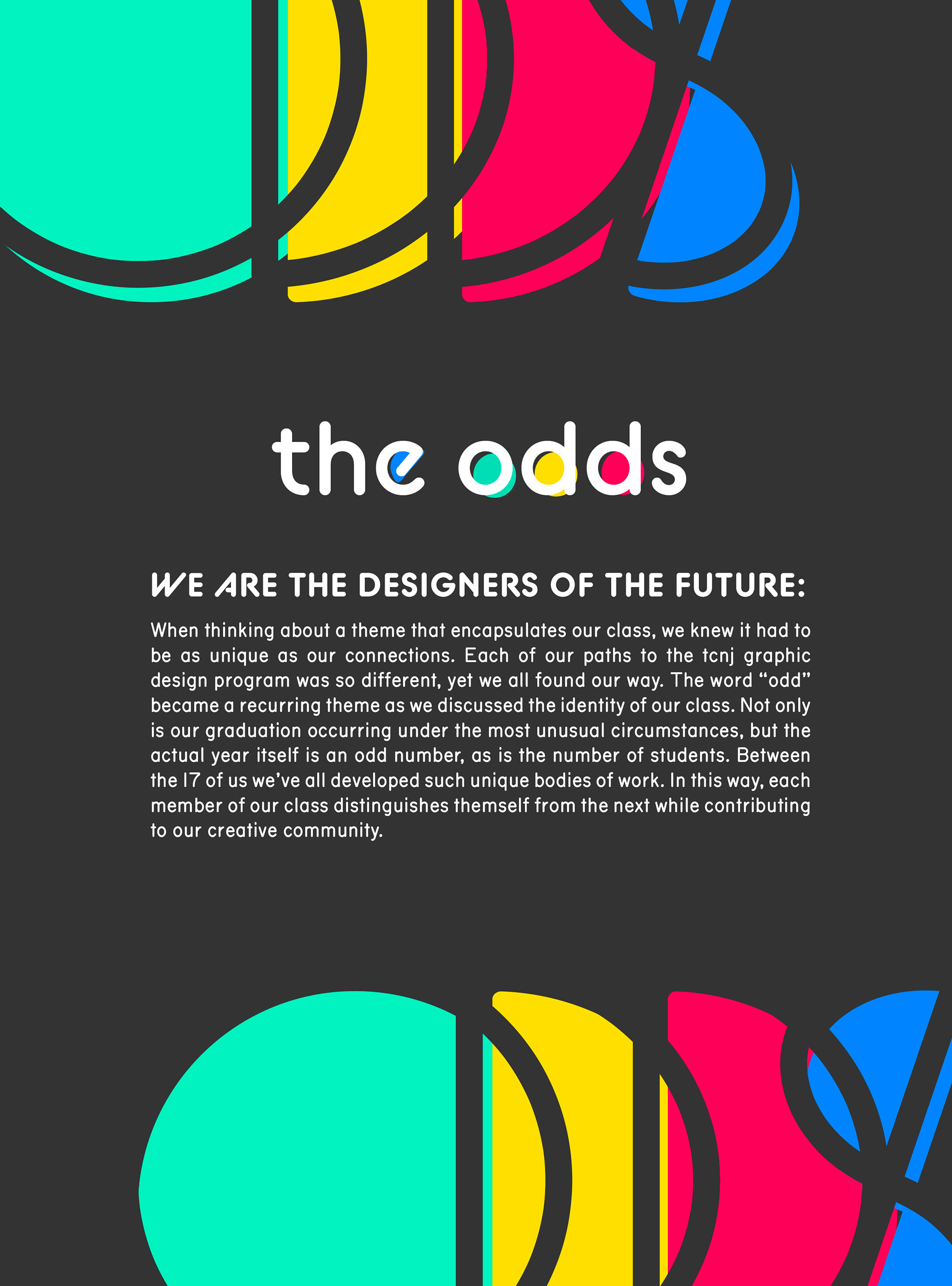
FINAL LOGO DESIGN
Using two of my earlier logo designs, we simplified certain aspects and made "odds" in the logomark more legible. This makes the style more modern while preserving the retro feel. The logo can appear on both white and charcoal backgrounds, however, we feel the version on the charcoal is more dynamic.
MY MAIN CONTRIBUTIONS
LOGO CONTRIBUTIONS
I created many early design options for the show. However, we agreed some of these earlier designs were too vintage. We wanted the retro feel while still having a modern design.
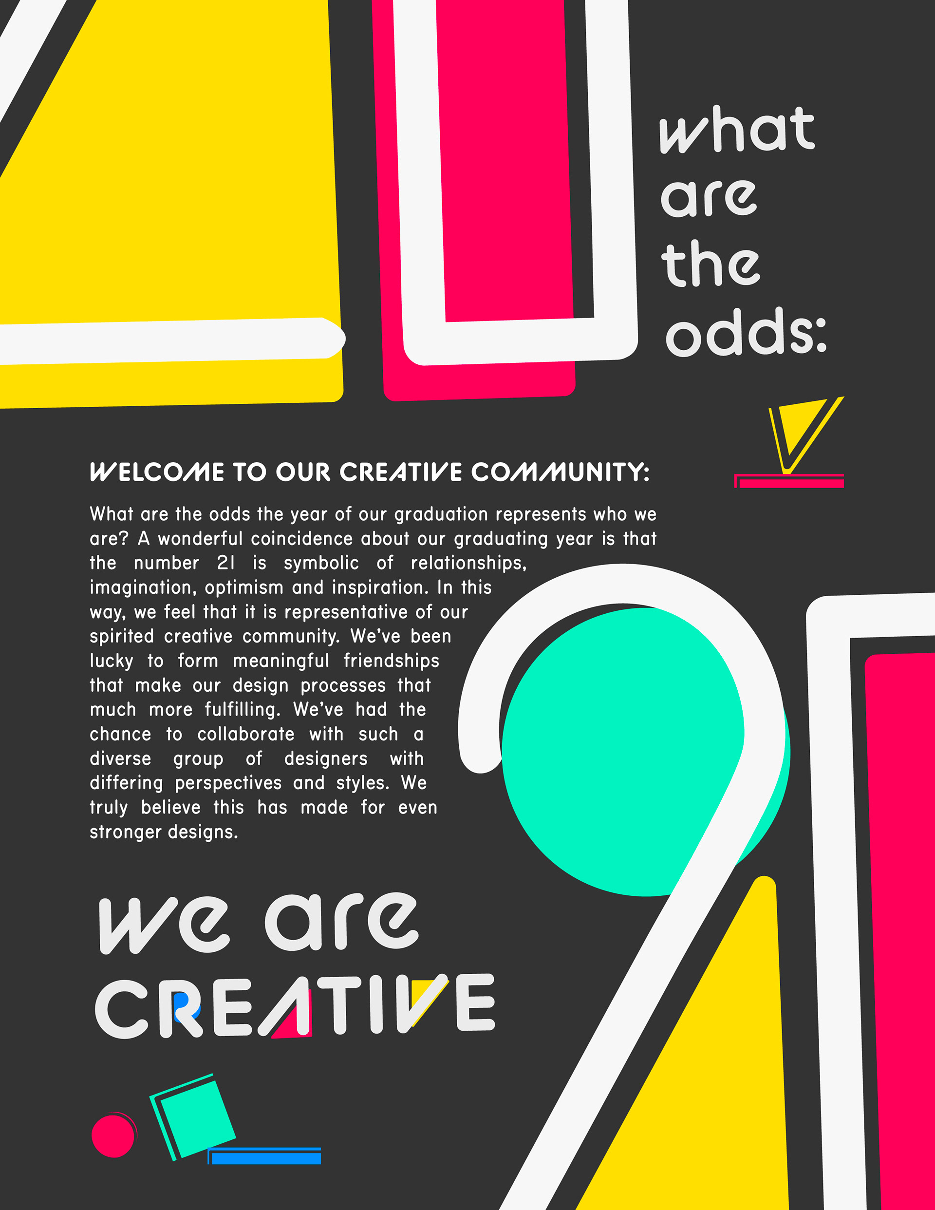
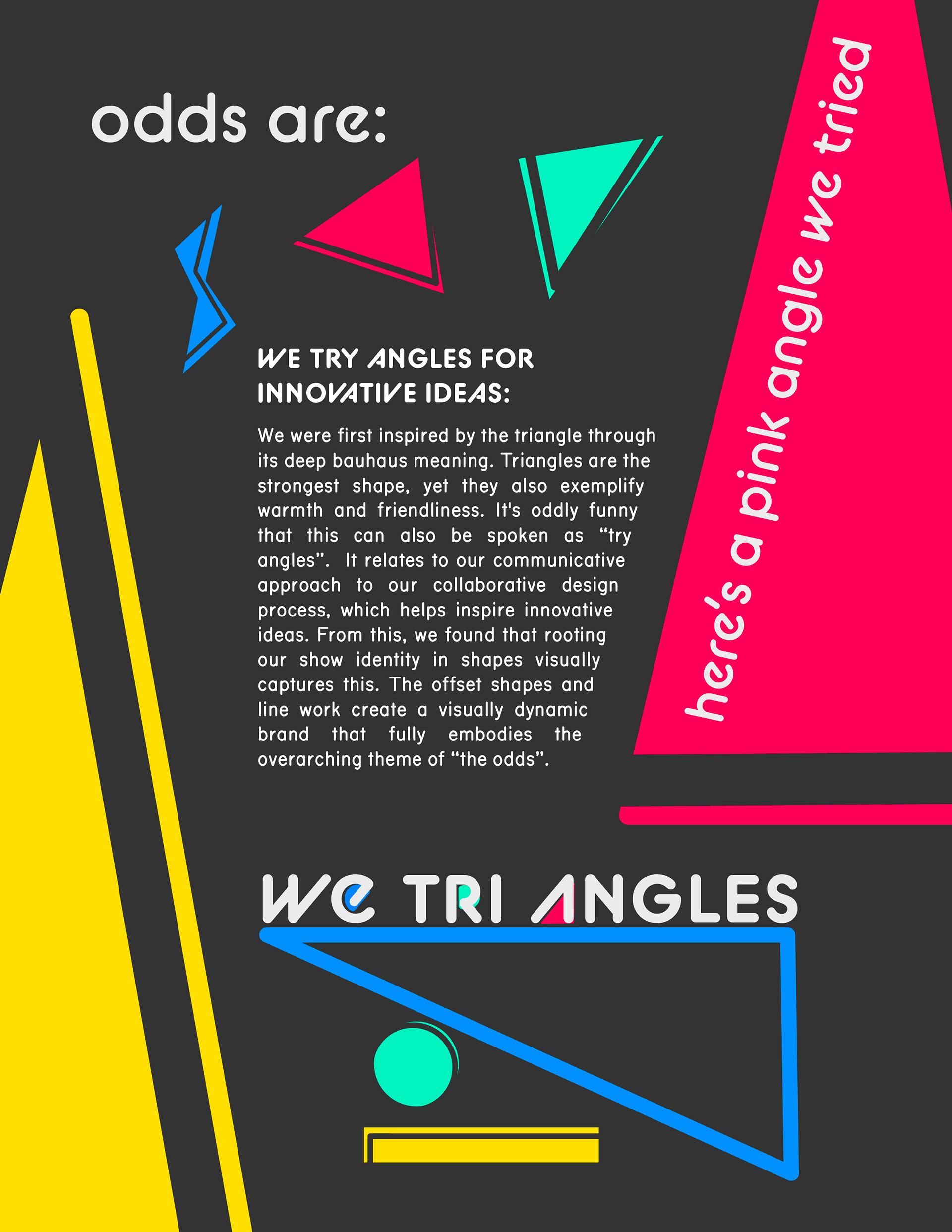
POSTER CONTRIBUTIONS
I also created a variety of posters for the show. Using shapes to emphasize certain themes and identifiers in our show, the break up of the themes is dynamic, odd and exciting.

GIF CONTRIBUTION
In addition, I created a small promotional gif for the show displayed both on instagram as well as the website.