
WHAT ???
The world is changing and humans are realizing the importance, relevance and benefits of animals, primarily dogs. Humans are inviting dogs into public settings more and more, including restaurants. We are seeing an eruption of all natural ingredient dog-food brands with a variety of options. Humans are more commonly outlandishly accommodating their dogs, with the realization that dogs only deserve nonsensical love. Creating a dog-based restaurant, specifically catering to dogs, seems like the next inevitable step to a world of animal-inclusivity—a restaurant that not only serves dogs, but is designed for them.
BUT...
But, how do we design graphically for dogs? How do we target dogs as the audience for a restaurant accommodated specifically for them? This is our dilemma—our design problem. The truth is, these designs would be out of reach for dogs. Without humans, dogs would never wander into a restaurant knowing it is for them. Dogs can’t read; they would never visually recognize a word or a logo. So, how do we solve this problem of branding a restaurant for dogs when the very purpose of designing is communicating in an understandable way?
HOW ???
Why not design using somewhat human societal norms, but in a very dog way? As much as it would be fun to communicate in barks and scratches, it would be visually incomprehensible to humans, who are the very creatures we will be ironically communicating with. While dogs will recognize some human words when they hear them, they still can’t read. So here is the irony—we need branding, a name, an identity. Let’s make it ambiguous or direct, or ironically—both. Simple, yet sophisticated—better yet, gibberish. Let’s combine all of these things and create ironic branding, visually communicating in a way in which dogs see and communicate in the world. Let’s create a visual identity for a dog restaurant based on the very aspects of what make up dogs’ identities.
CHALLENGE
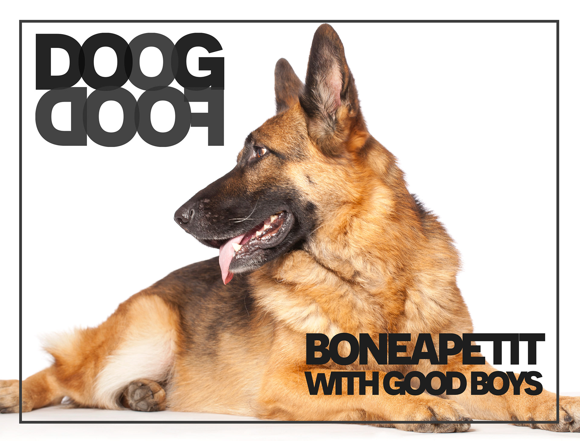
DoogDoof was a semester long project in which I branded a dog restaurant. A huge challenge I faced was how to brand toward my ironic dog audience when actually needing to target their human owners. I solved this by communicating to humans in ways dogs see, hear, and communicate in the world. This project is heavily conceptual with an extensive typographic system that breaks many rules which was a primary focus while creating this project.
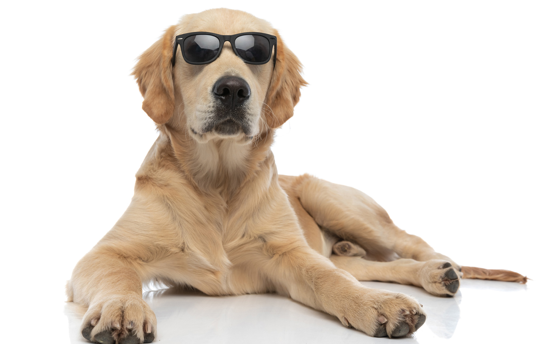
FIRST CONCEPT (left)
My first concept was more outwardly and overtly adorable and fun with its use of wordplay and cute iconography. I felt this concept was too conventional and wanted this restaurant to be extremely unique in its branding.
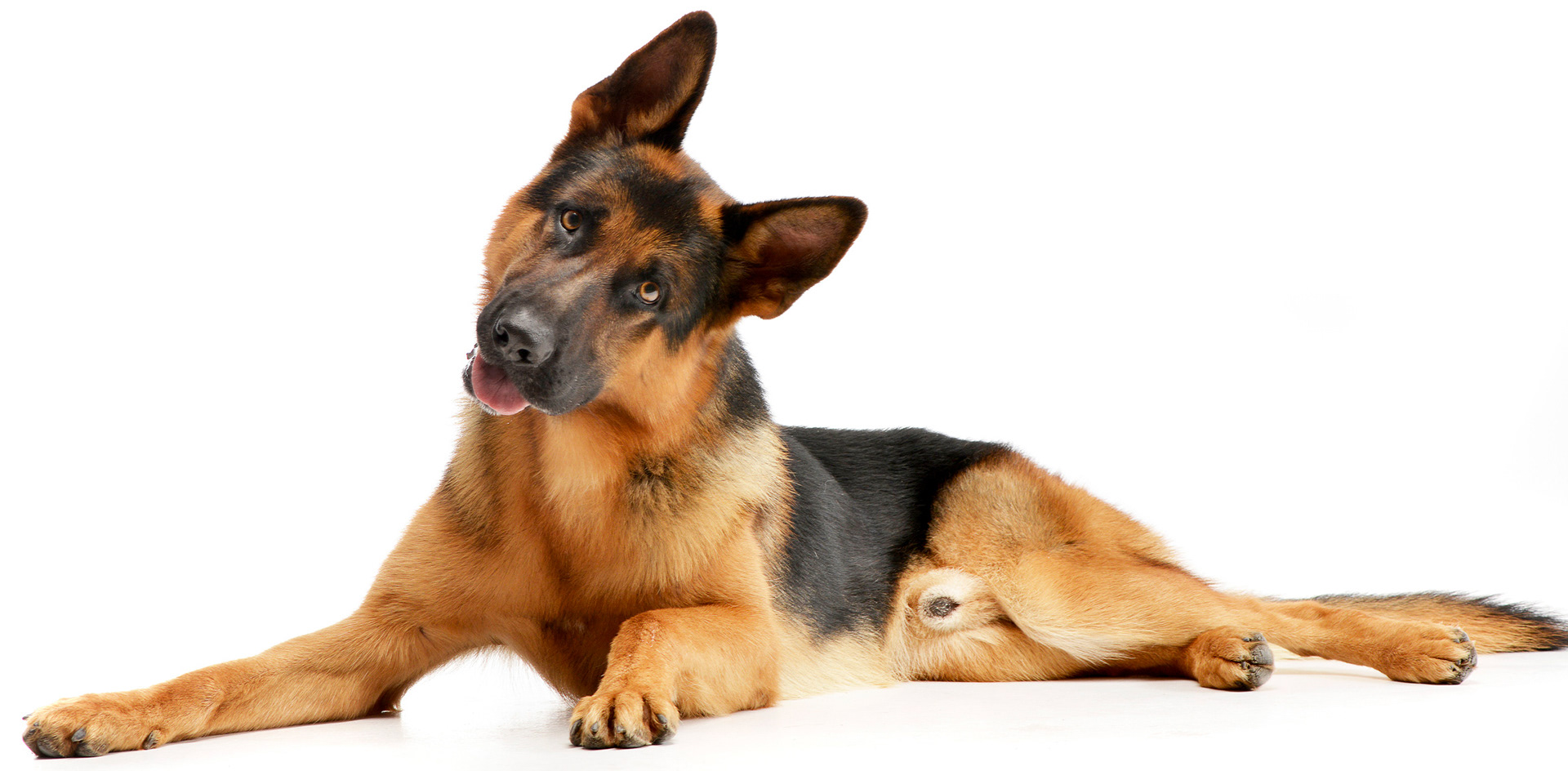
FINAL CONCEPT (right)
When diving into what would make this identity unique, I found the paradox really interesting: a dog restaurant catering to dogs but communicating with humans. Irony became a central focus. The exclusively typographic system communicates to humans the way that dogs see, hear and communicate in the world.
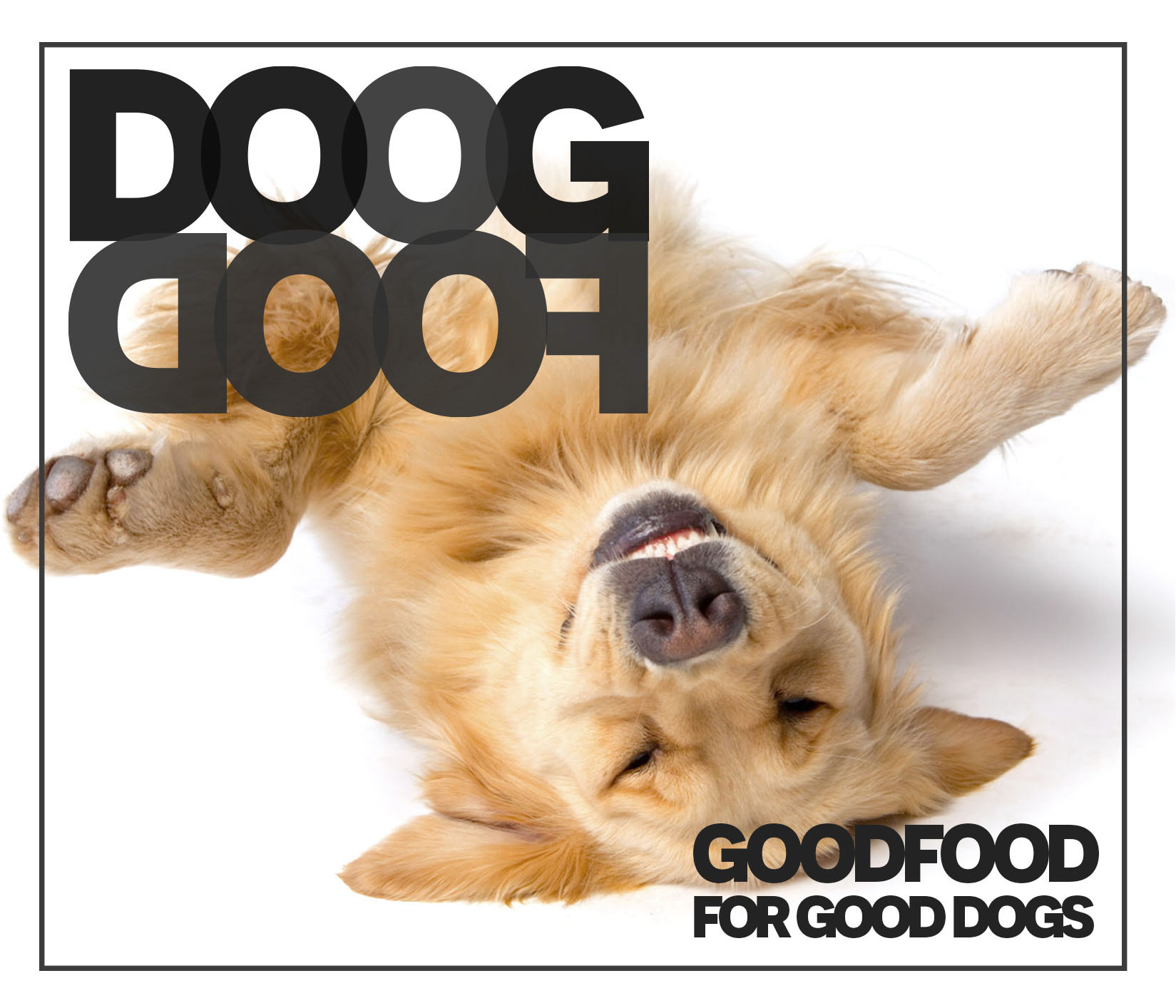
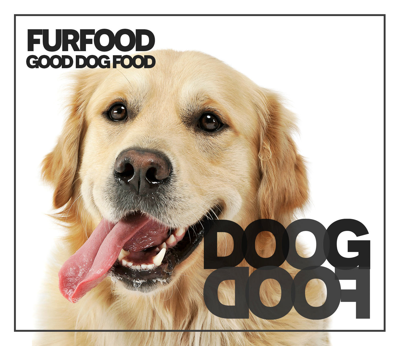
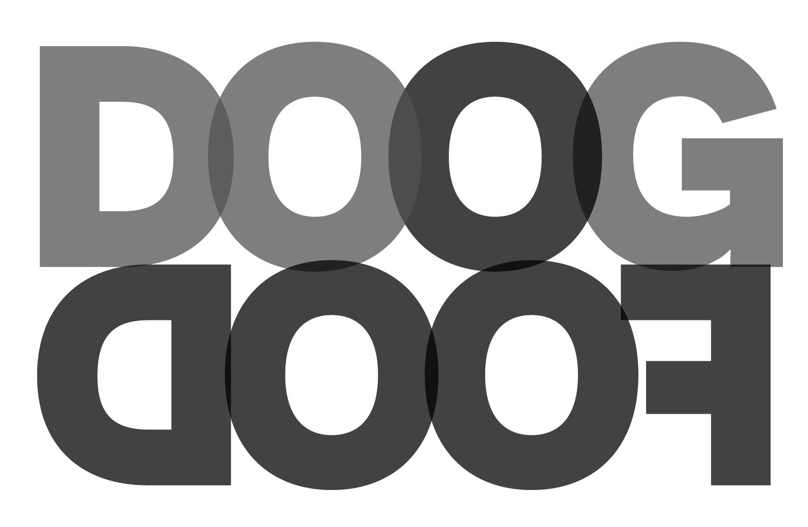
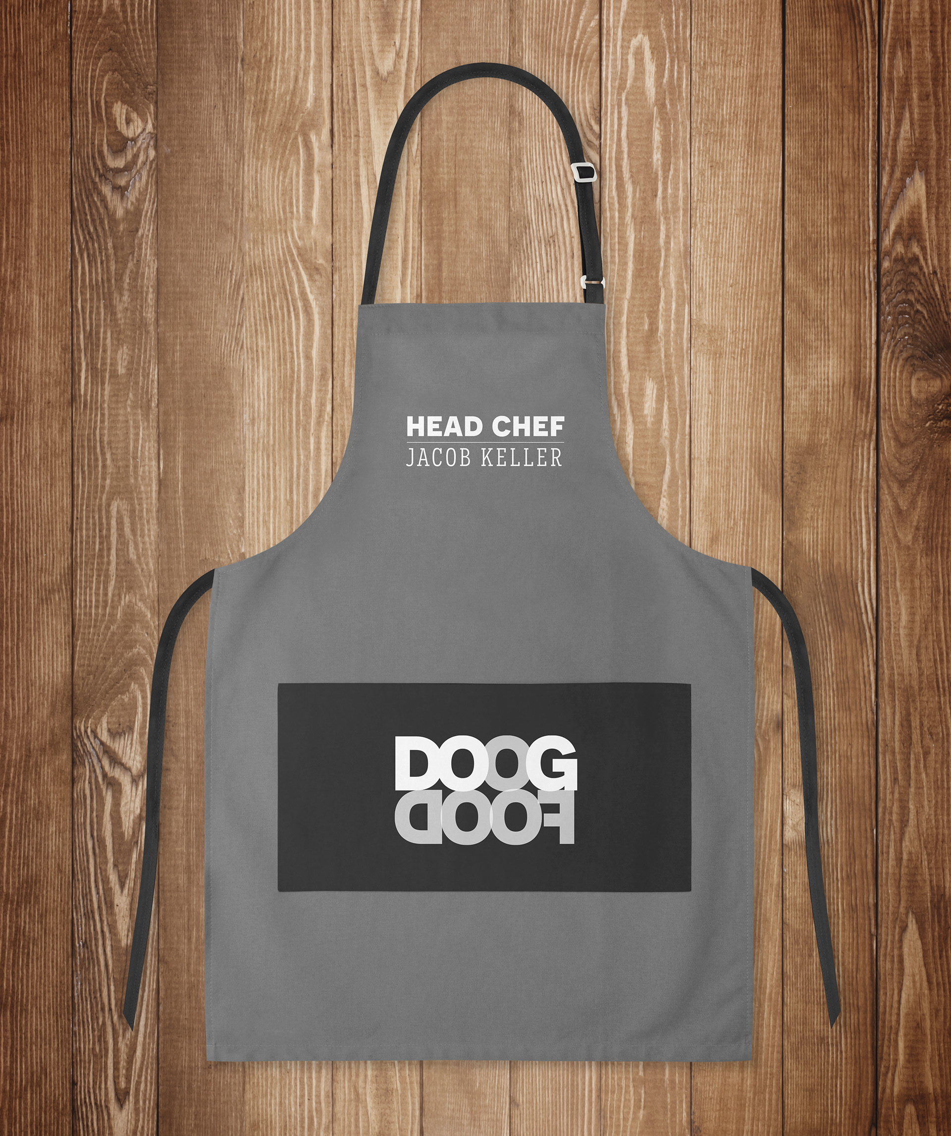
The name "doogdoof" might be how a dog would see the name "goodfood". They are two words dogs learn to understand, but written out, might look like gibberish to a dog. Within the word "doog" is also the word "dog". By emphasizing those letters, the restaurant is speaking directly to humans with the phrase "dogfood".

COLOR
The branding focuses on the idea of irony. The joke has been taken so far, it's almost serious. Grayscale is used exclusively for the designs. While dogs do see blues and yellows, they're unnecessary. Keeping with the theme of simple and direct and sort of ironically serious, I found that black, white and grays with different opacities could give that effect.
NOVECENTO
TYPOGRAPHY:
MENUS & WORDPLAY
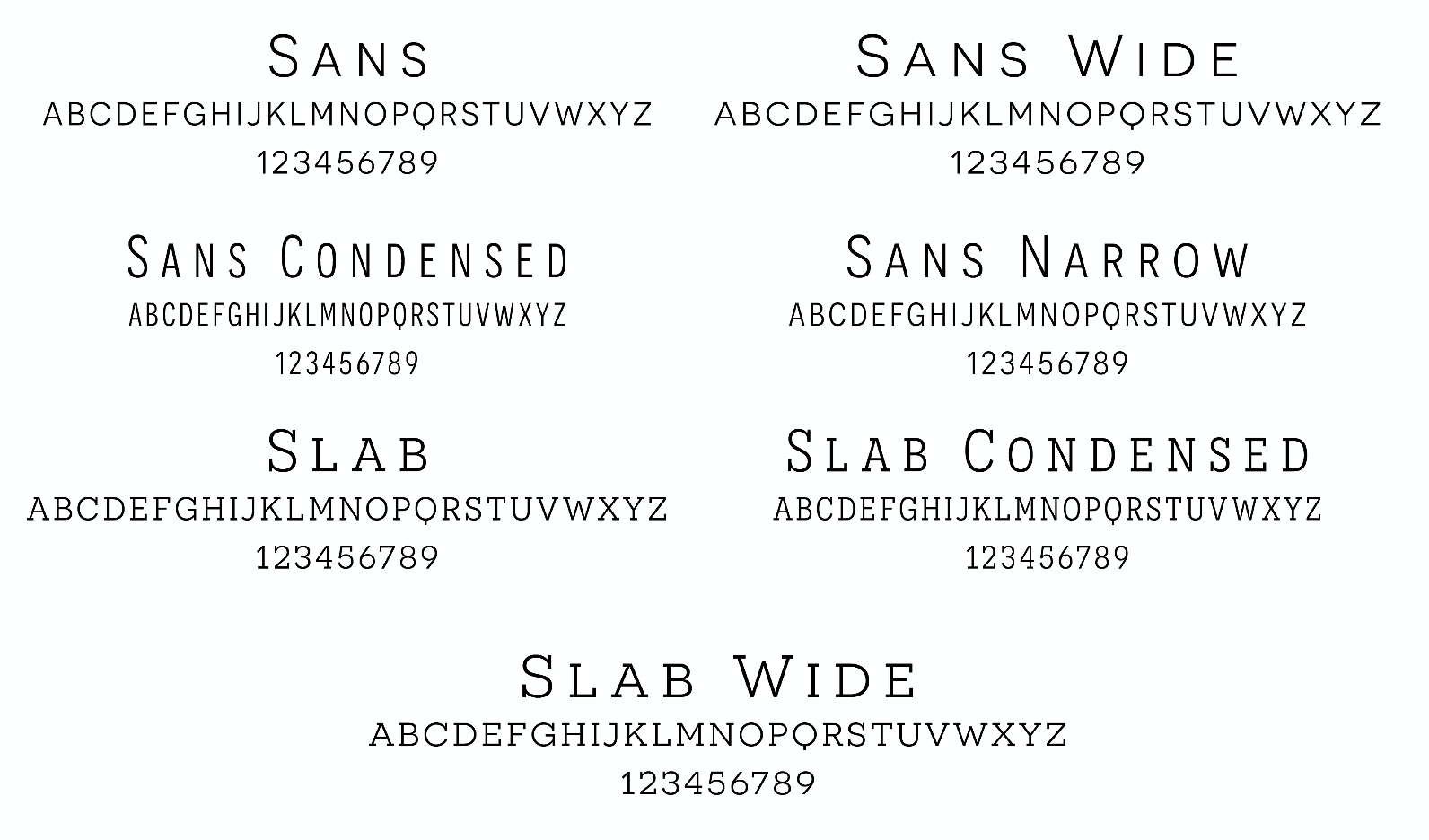
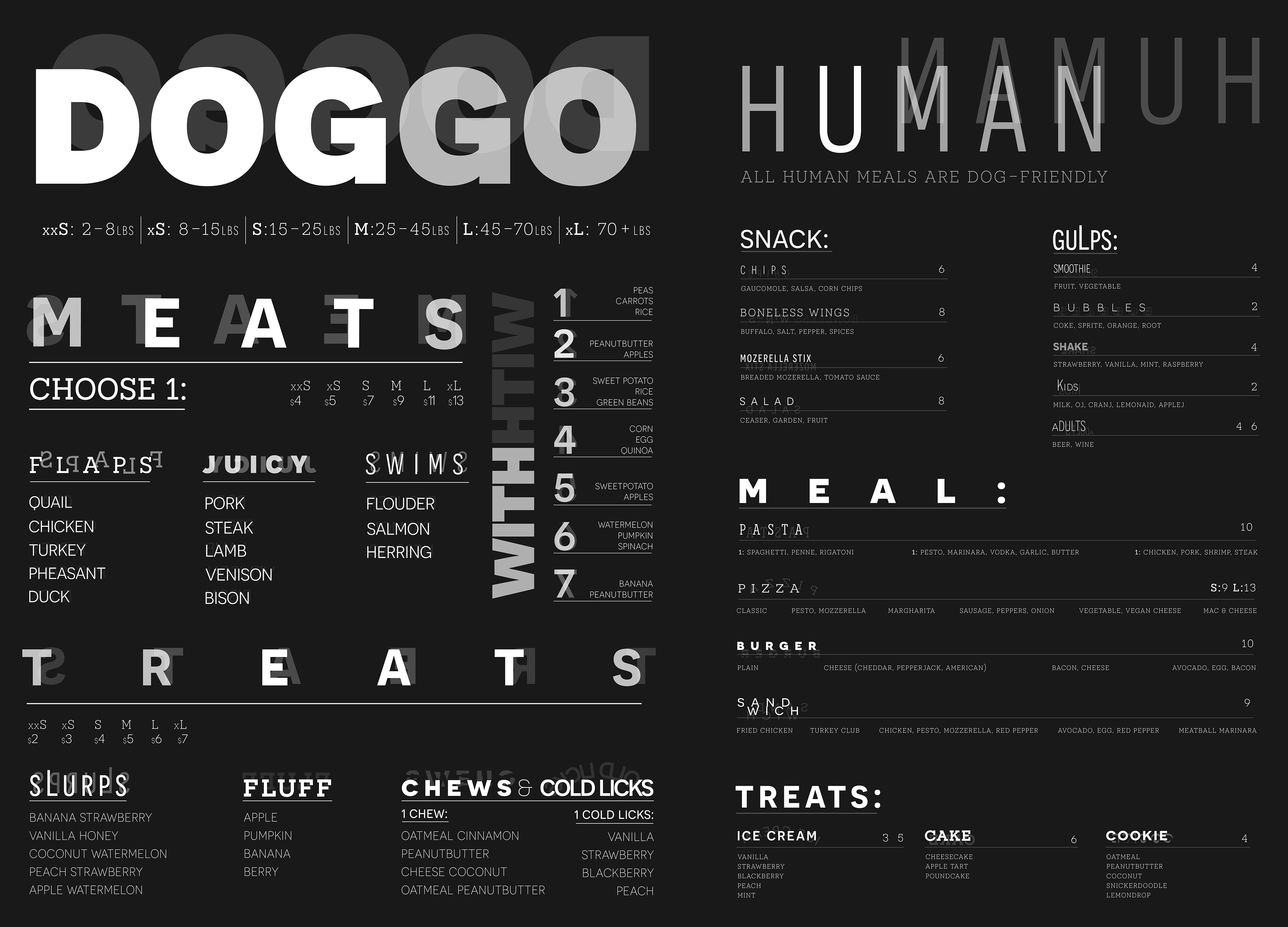
While breaking typographic rules is normally frowned upon, it better emphasizes the irony of this concept. I use the entire Novecento family, an all caps very extensive type family. The all caps family is loud and exciting, simple, yet direct and has a personality similar to that of a dog.
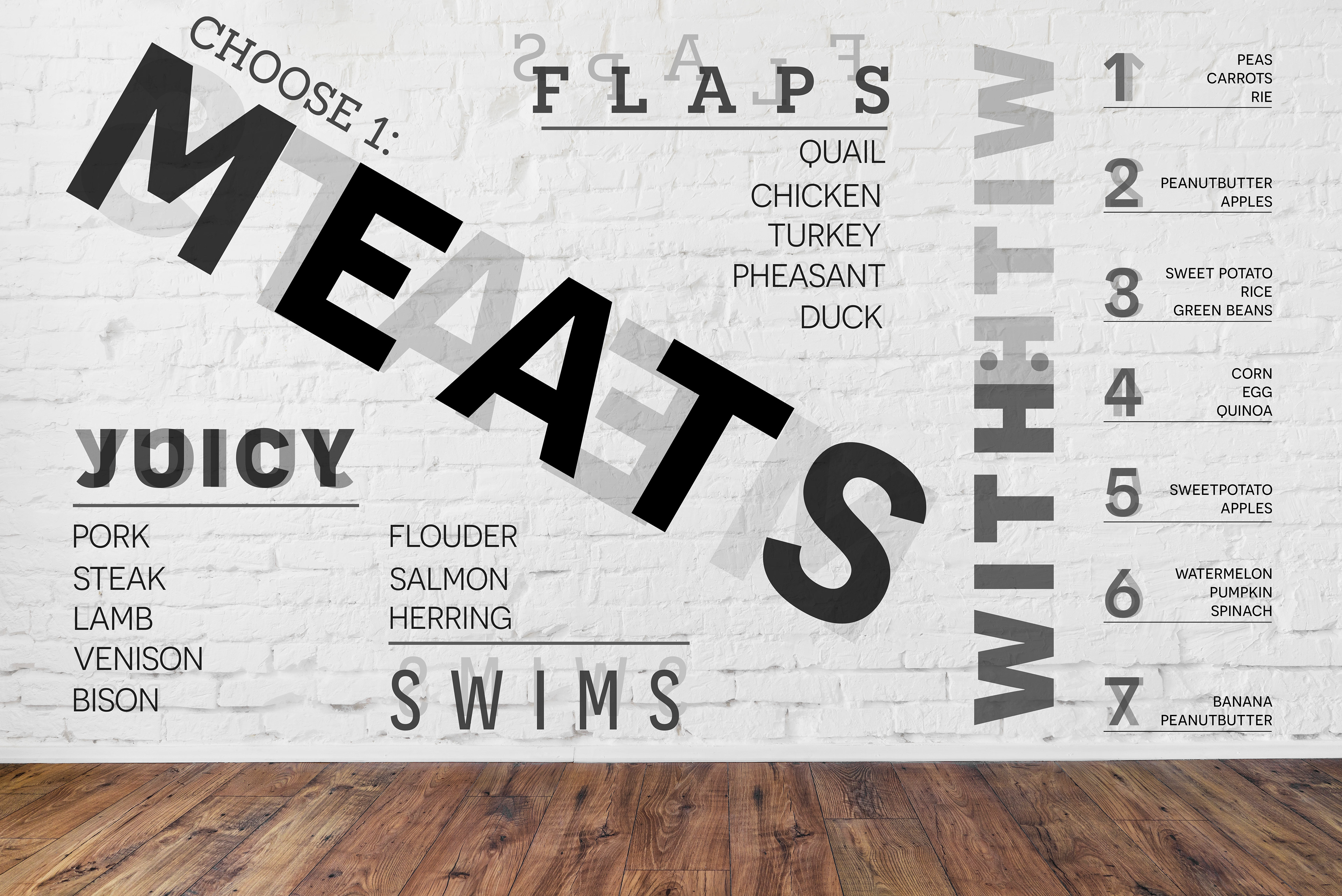
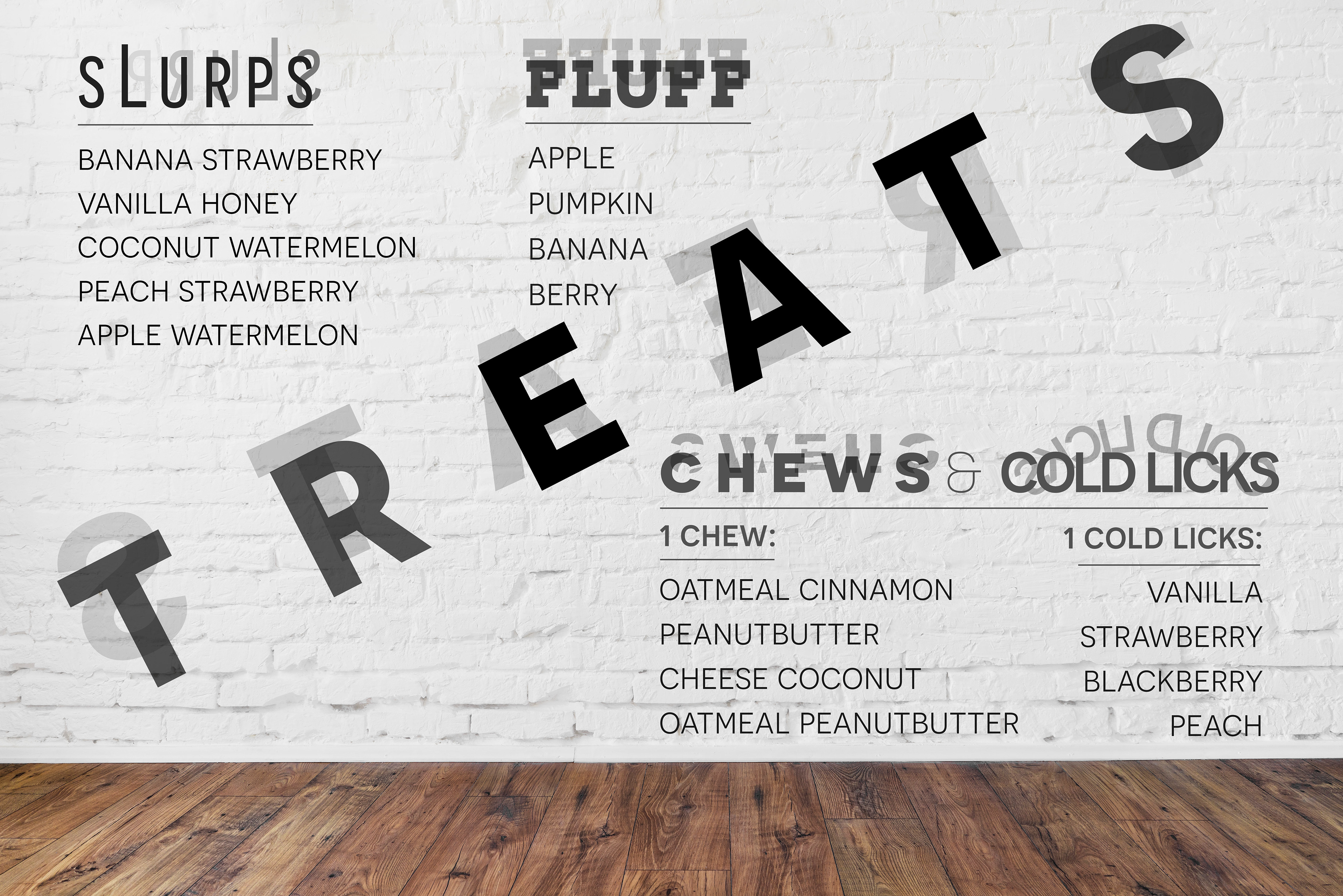
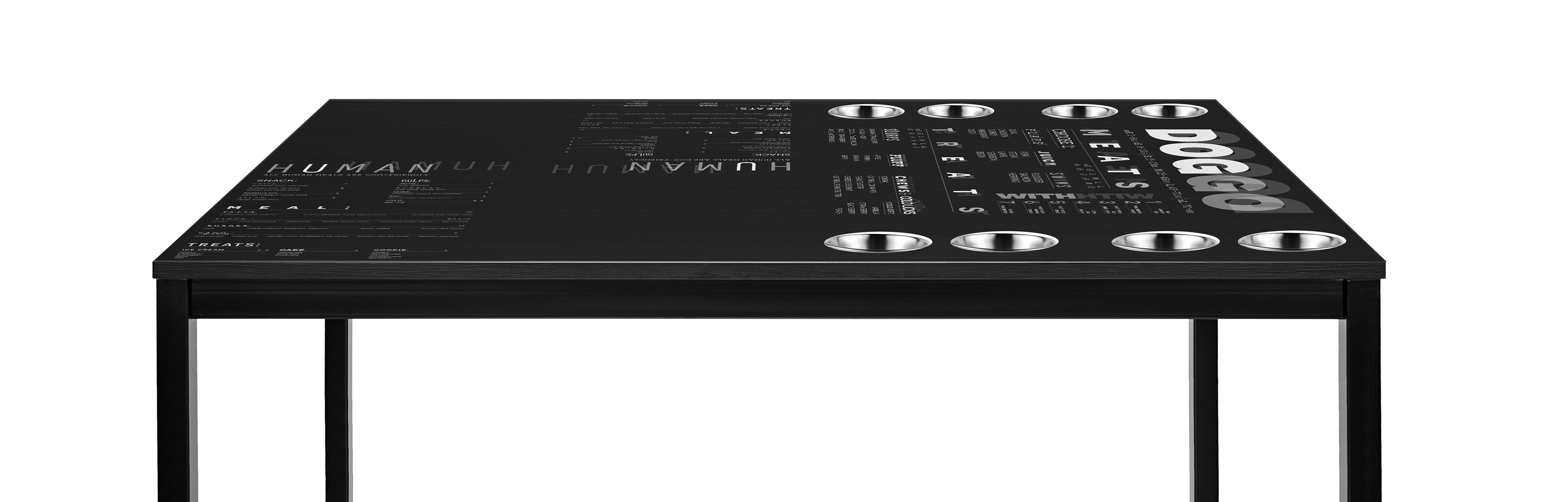
Throughout each menu, depending on the word, different typefaces embody those words. For example, "juicy" is in a thick, heavy typeface. However, the word is also literally reflected behind itself, adding in that theme of benign shapes and gibberish. Those reflections also emphasize even further how dogs see things. For example, arranging the letters in the word "flaps" to look like flapping wings. The larger section headers also highlight words within, such as "eat" in "meat", utilizing wordplay to emphasize words dogs might know. The human menu also uses this typographic system but in a simpler way.
The menu system is fittingly direct to symbolize the way dogs communicate. Dogs may recognize the specific keywords used to represent various food groups. For example, “flaps” represents the way dogs see birds, “juicy” describes the sensation of red meats, and “cold licks” describes the sensation and way they eat ice cream.
PLACEMENT:
TABLES & WALLS
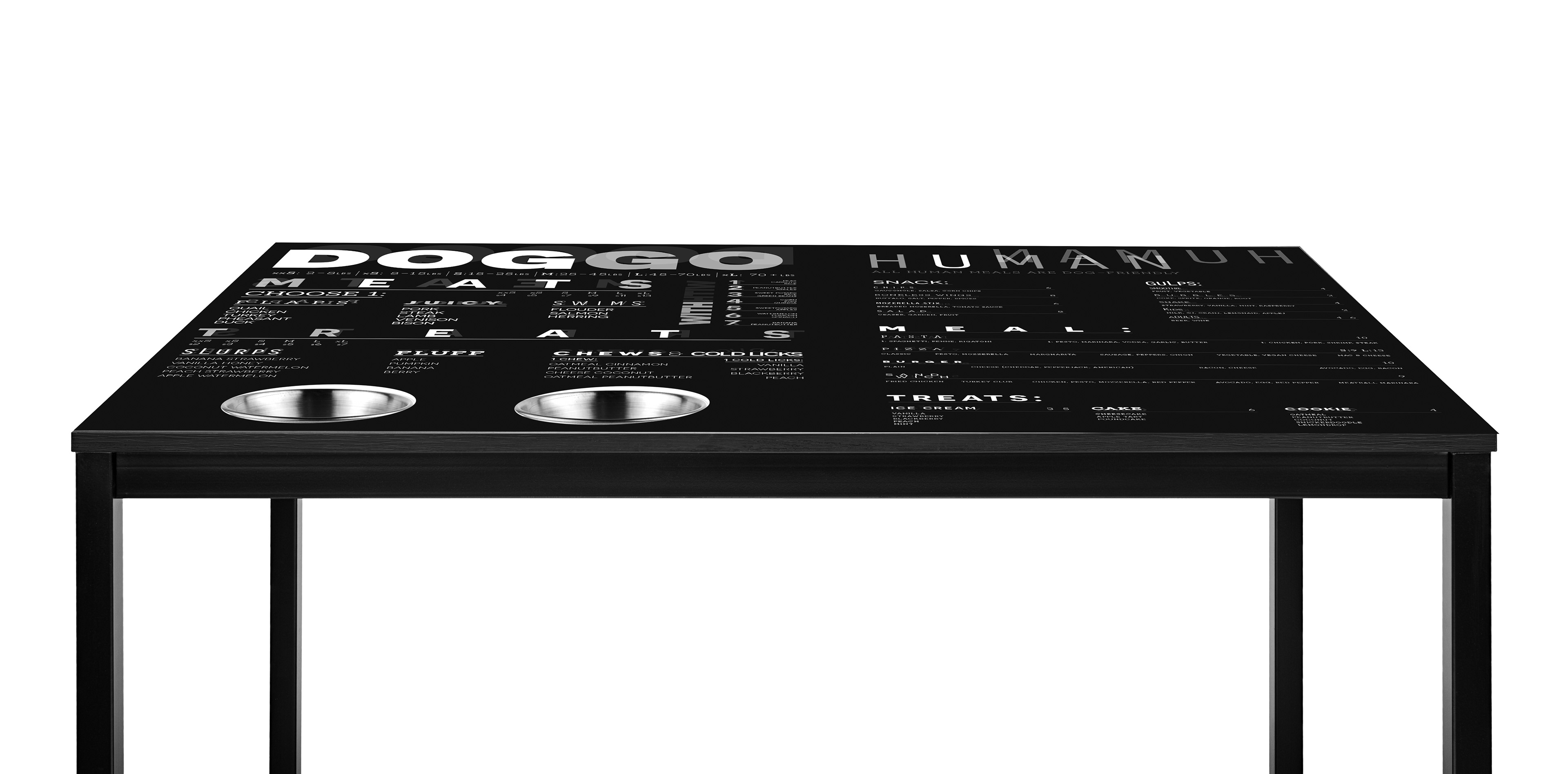
The menus on the walls have a sense of movement and energy. The diagonals fill the walls in the same way dogs act, running through the house, or tilting their heads. The larger chunky typeface is almost barking at humans making its presence known, much like the presence of a dog. The actual placement of the words, specifically on the "meats" menu, physically forces humans to look where dogs would to see those animals. For example, humans will have to look up to see "birds" or "flaps" and look down to see "fish" or "swims".
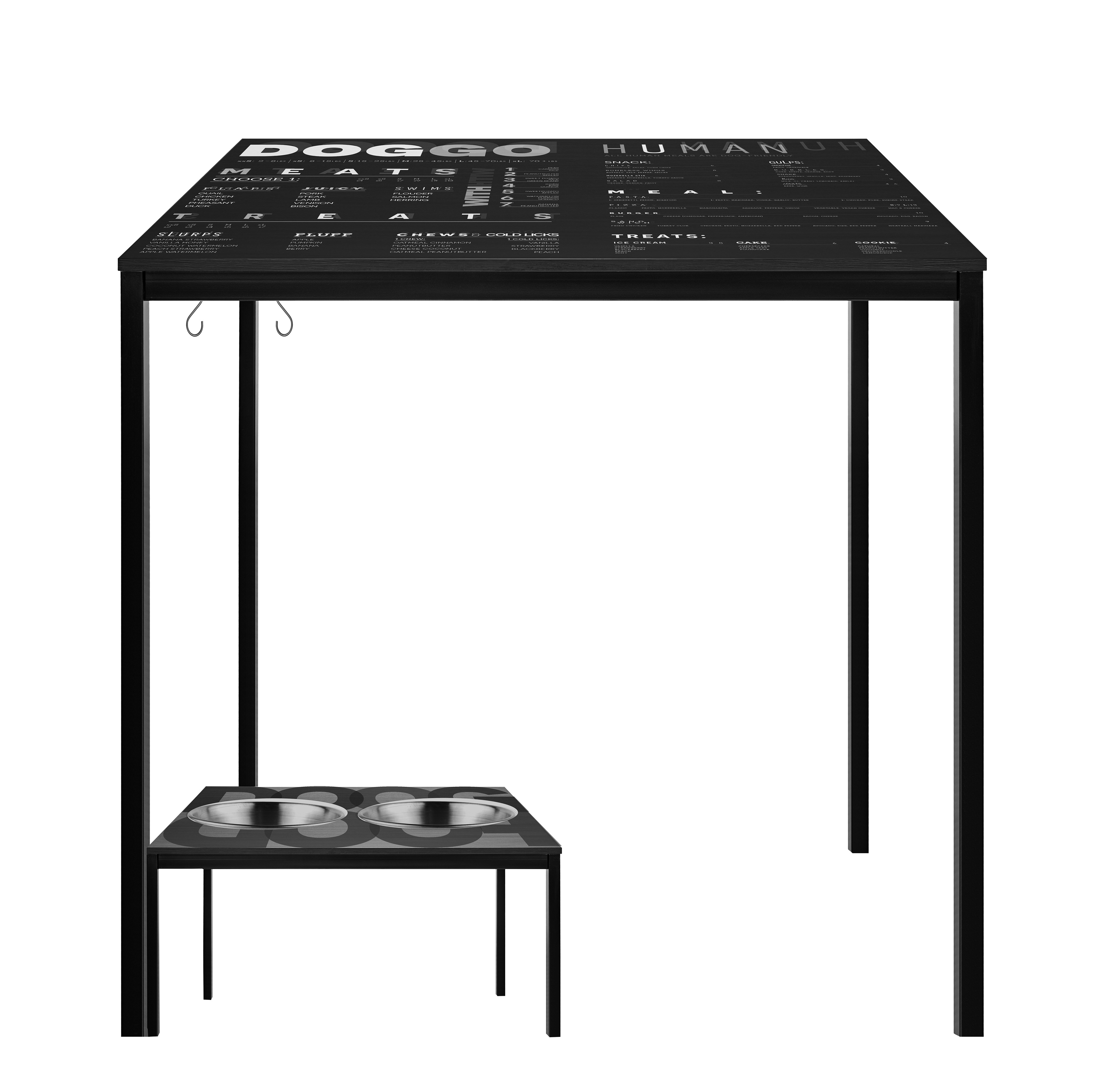
Tables for the restaurant have the full menu embedded within them because dogs might chew on handheld menus. Looking down at the table, the menu is right in front of you, much like a dog. Bowls are built into the indoor tables to stay in place. Outdoor human standing tables have hooks for leashes as well as a smaller doggo table.

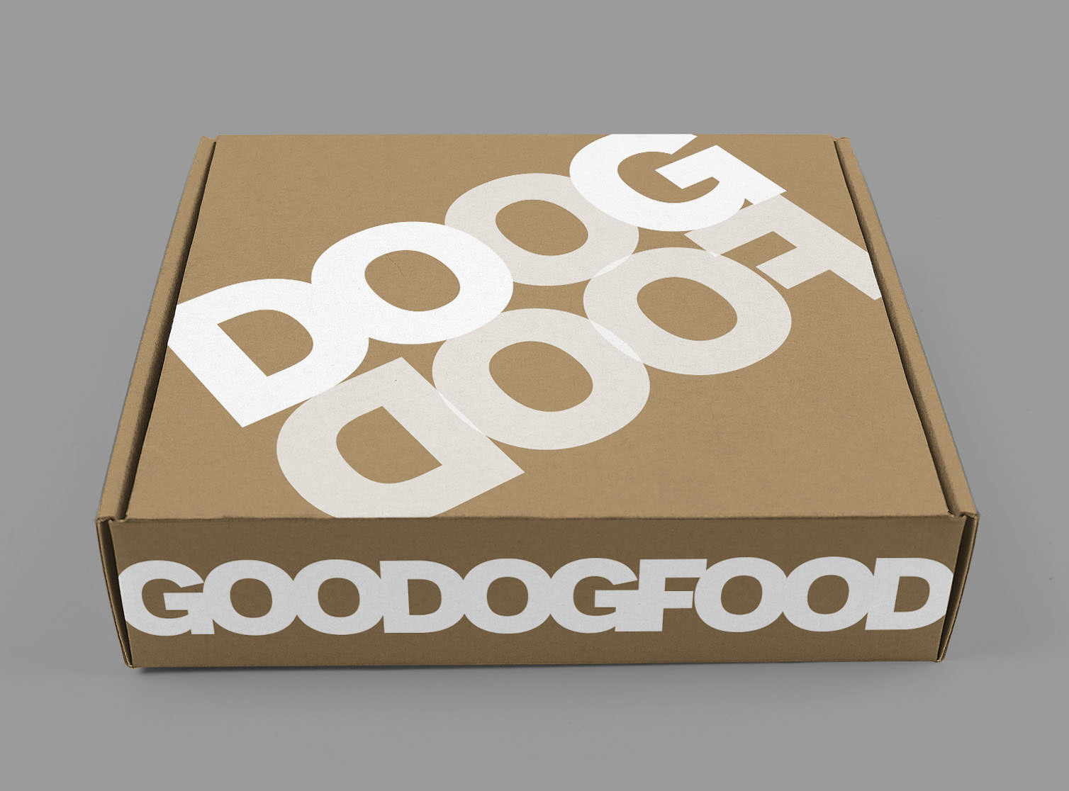
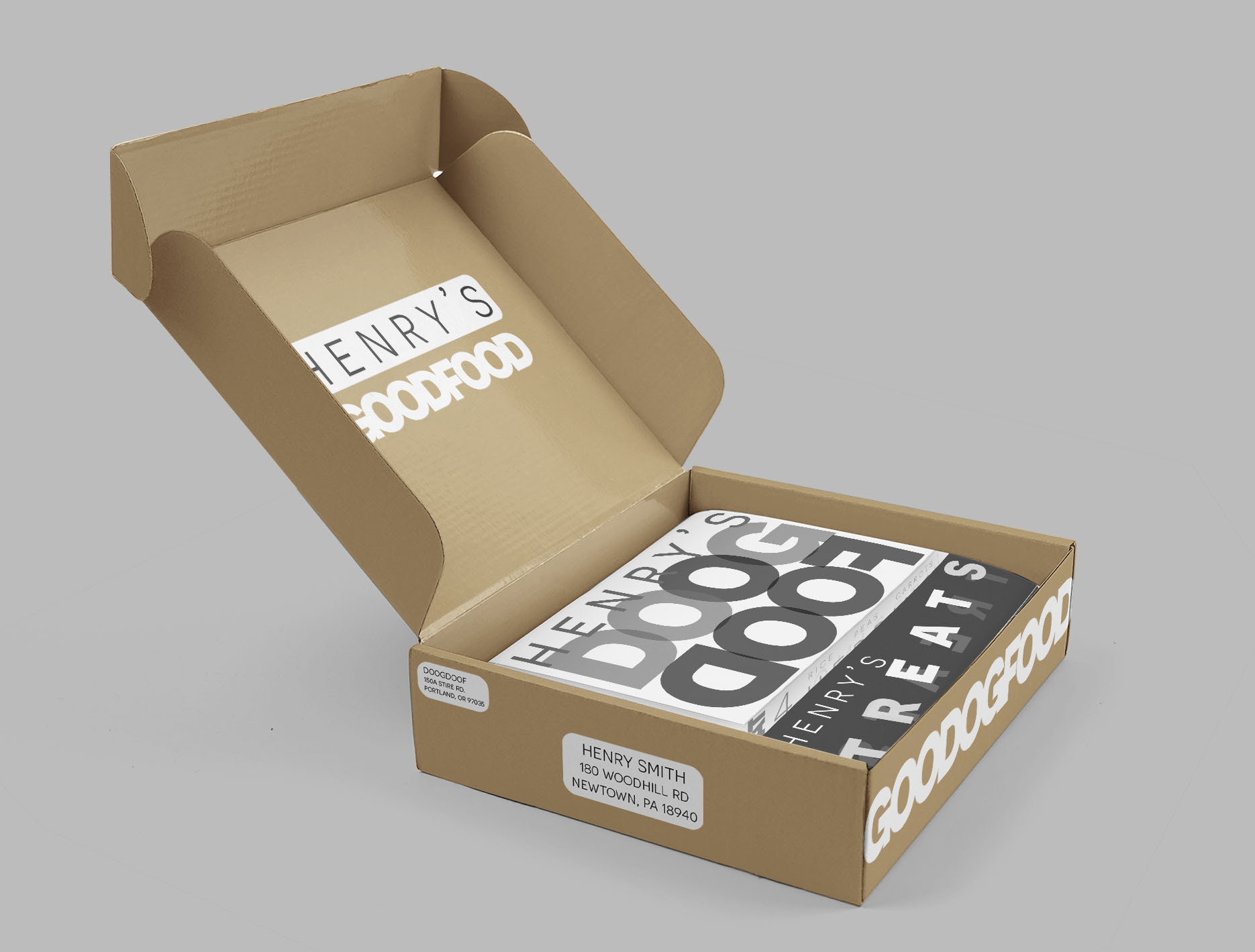
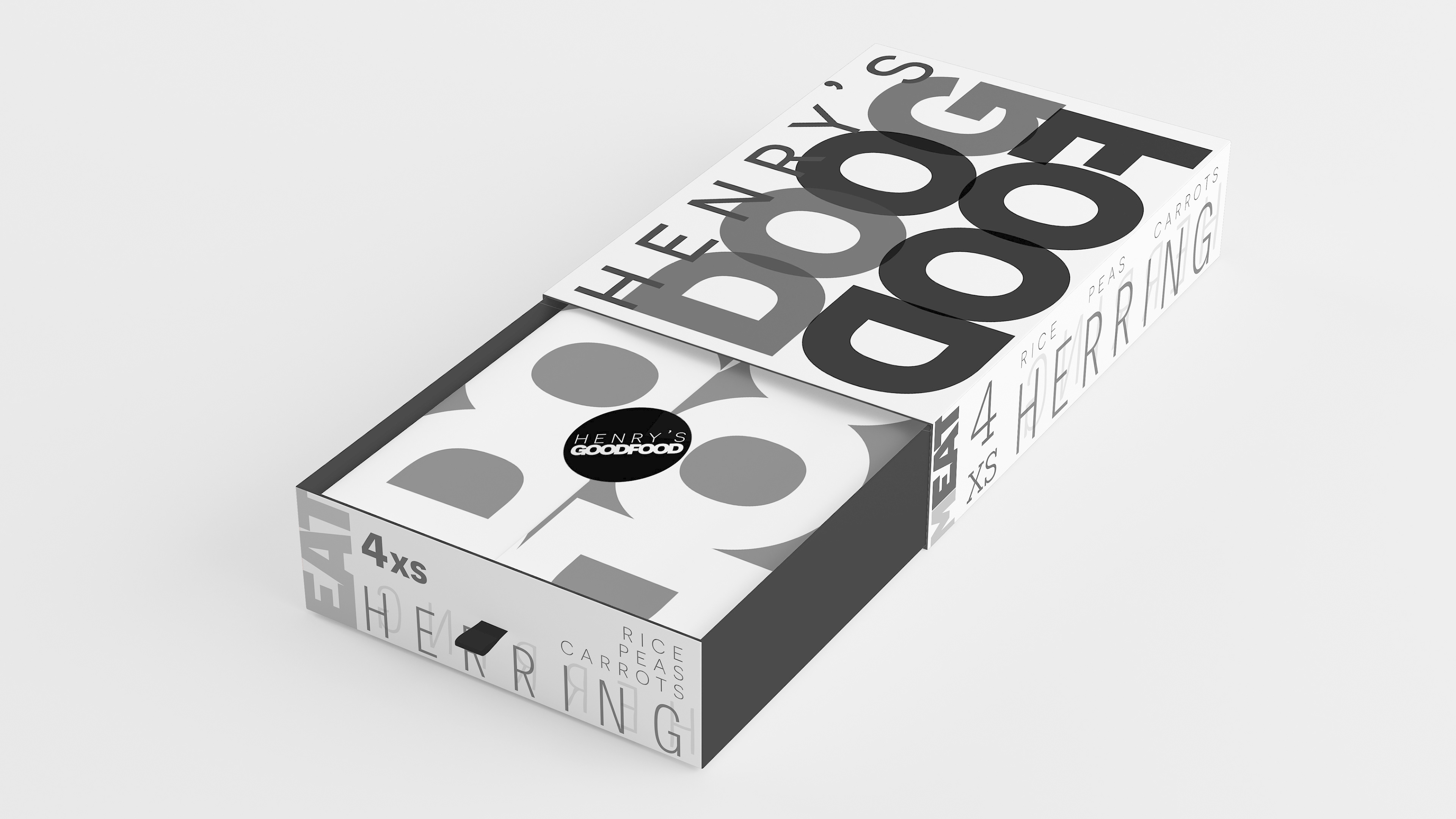
SUBSCRIPTION SERVICE
Doogdoof also has a subscription service available. The packaging is customized for each dog with their name: “Henry’s good food, "Henry’s doogdoof”, and “Henry’s treats”. They state what each box contains loudly and unmistakably.
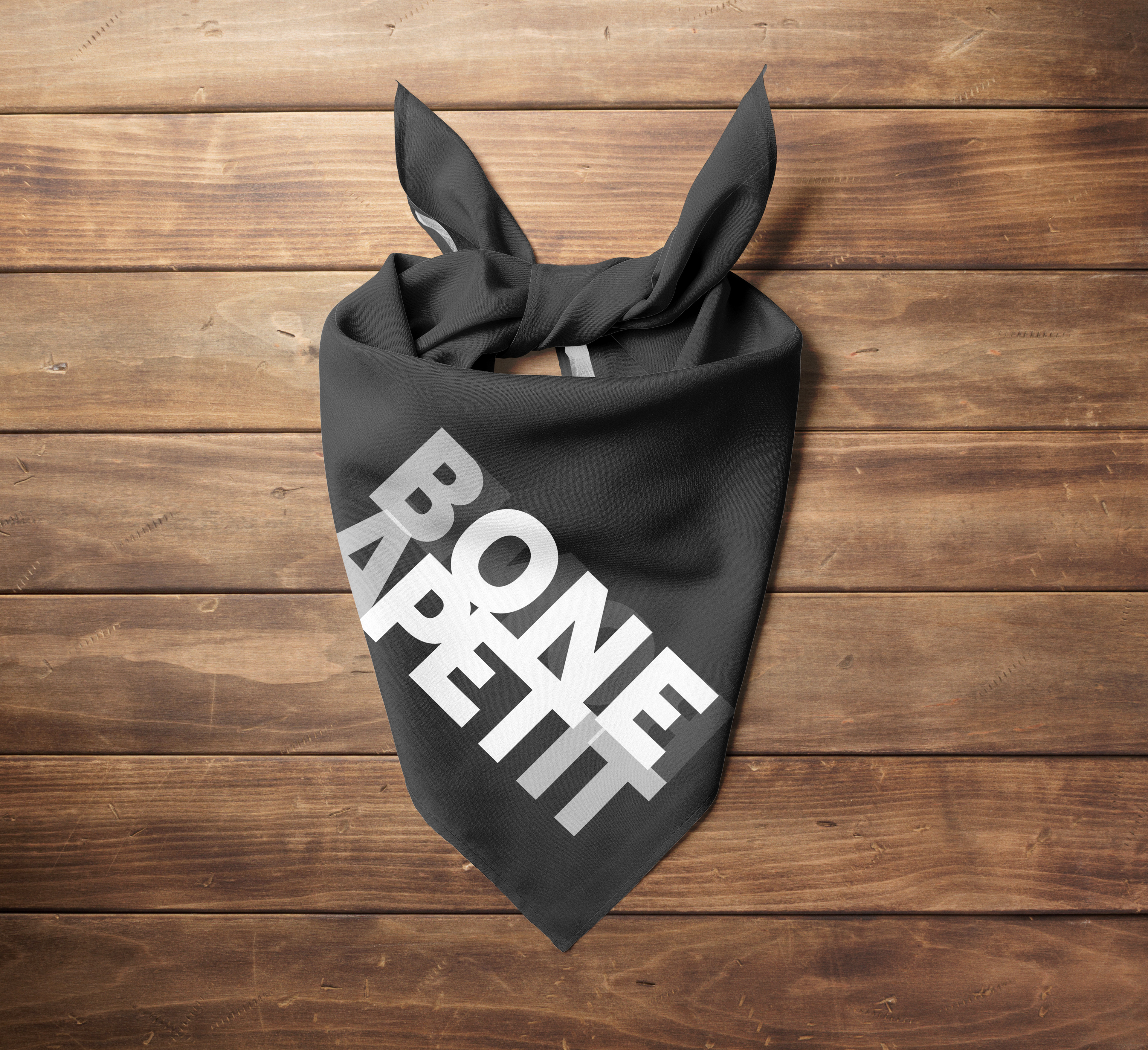
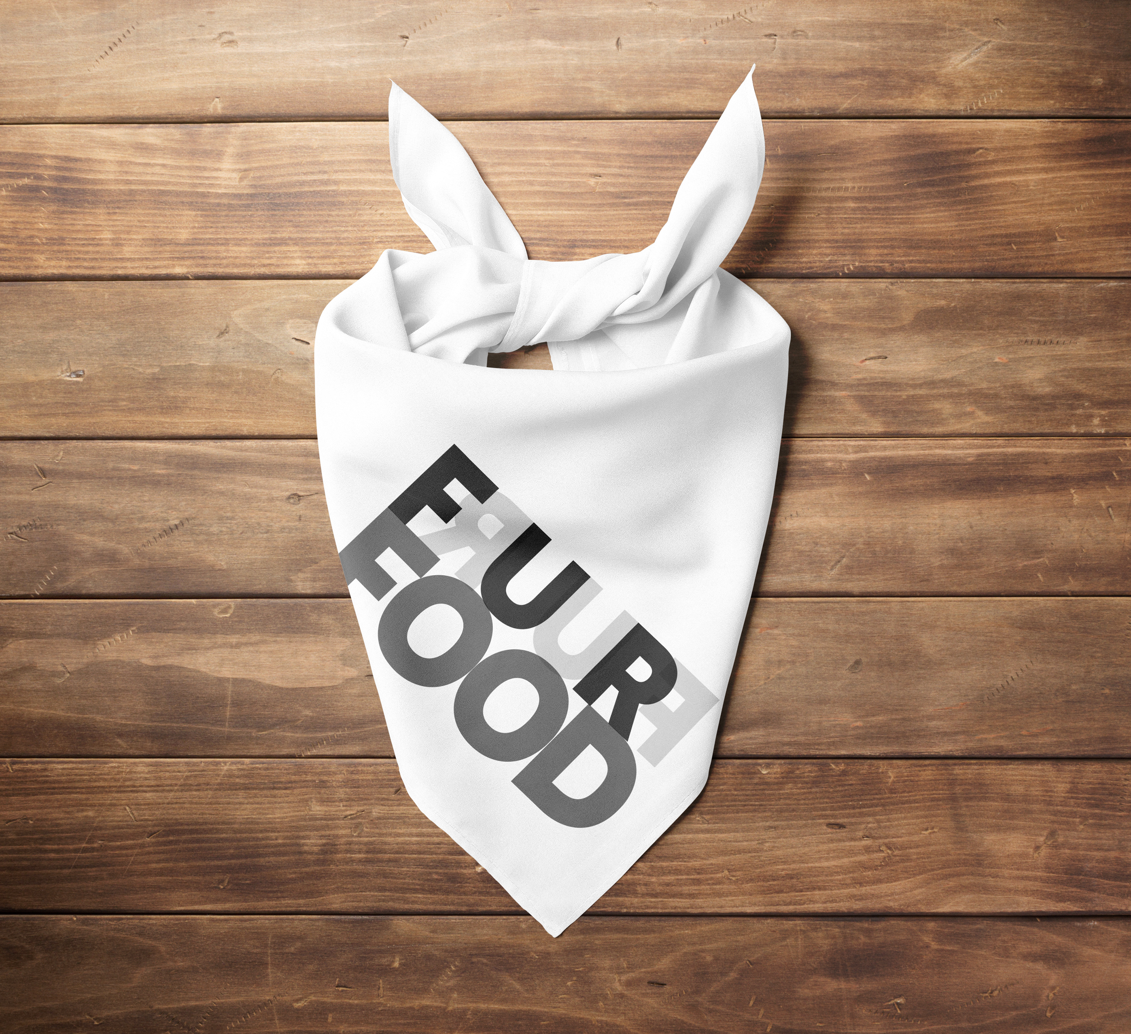
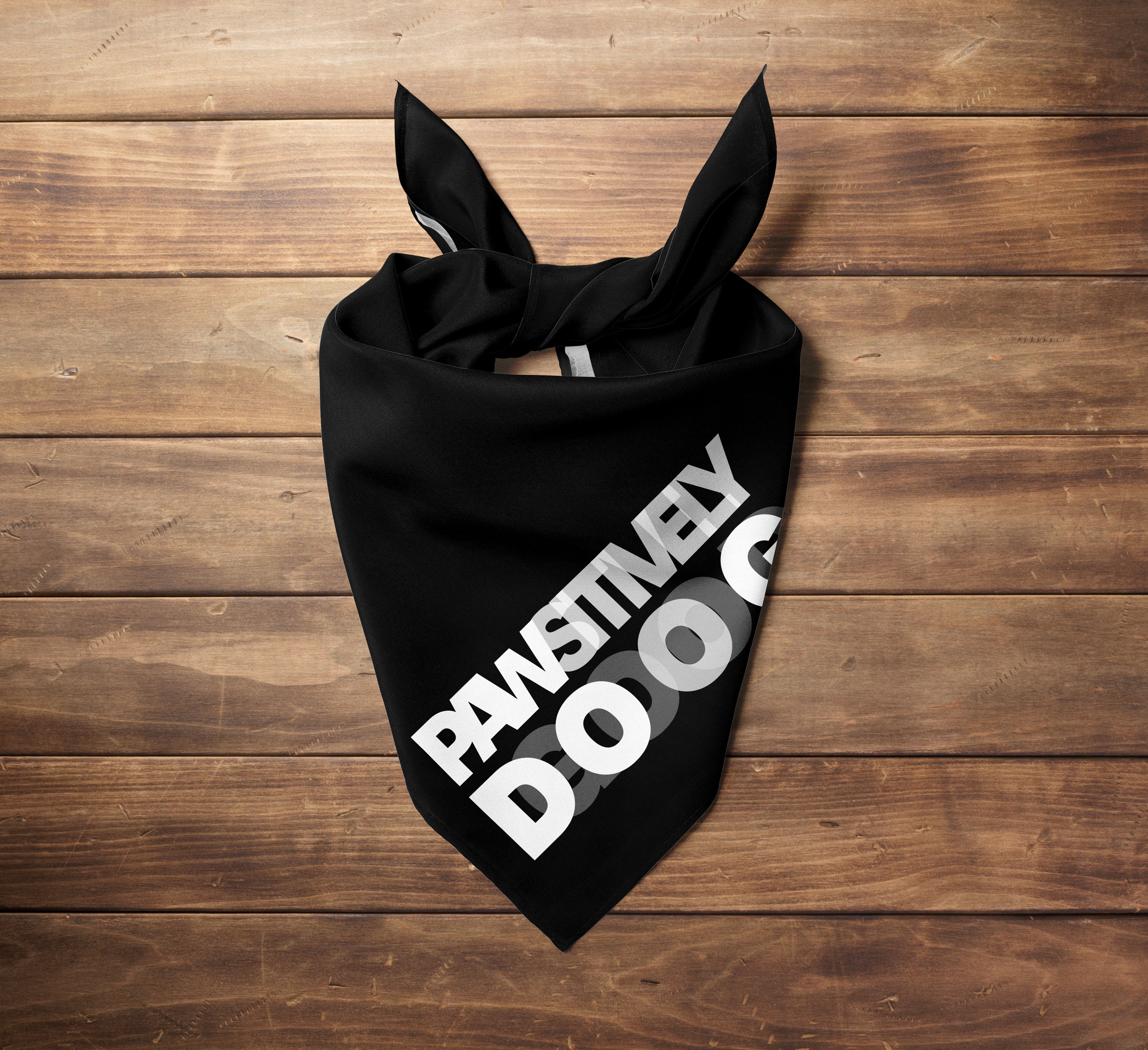
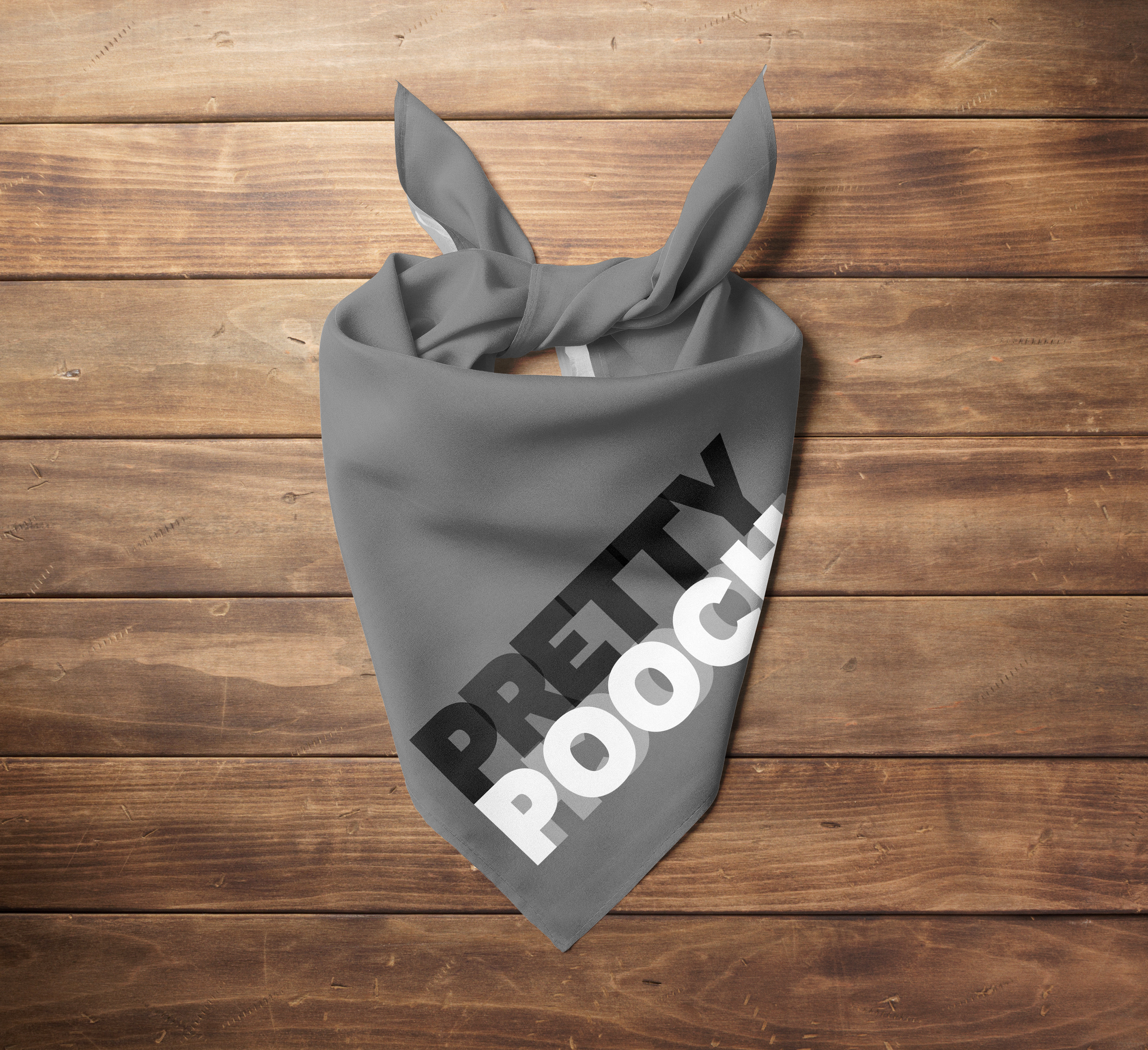
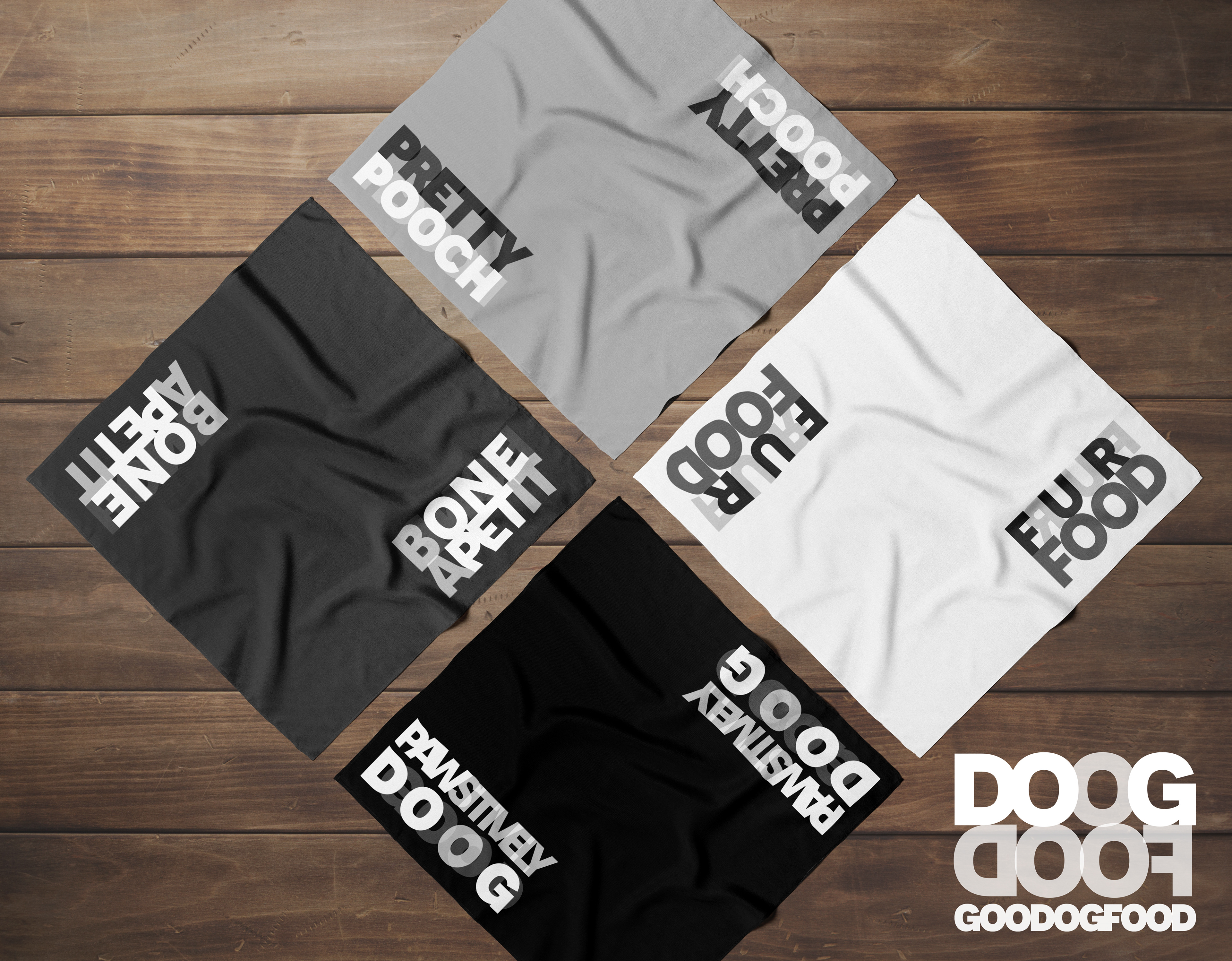
BANDANAS
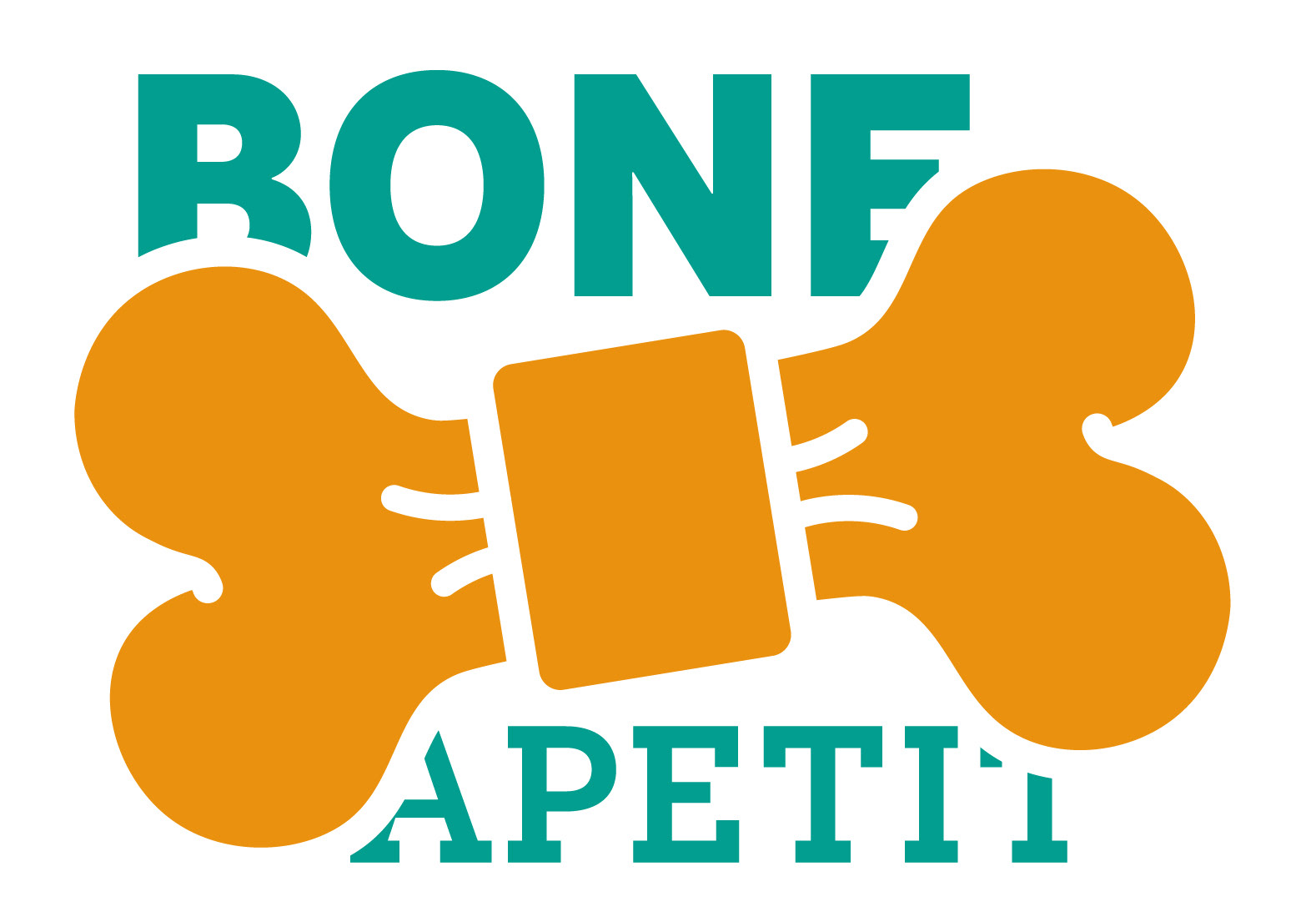
Bandanas for the dogs are designed with a different play on words, such as "bone apetit" and "fur food". The wordplay also highlights or reflects words within, such as "one pet" in "bone apetit", and "petty pooch" in "pretty pooch".
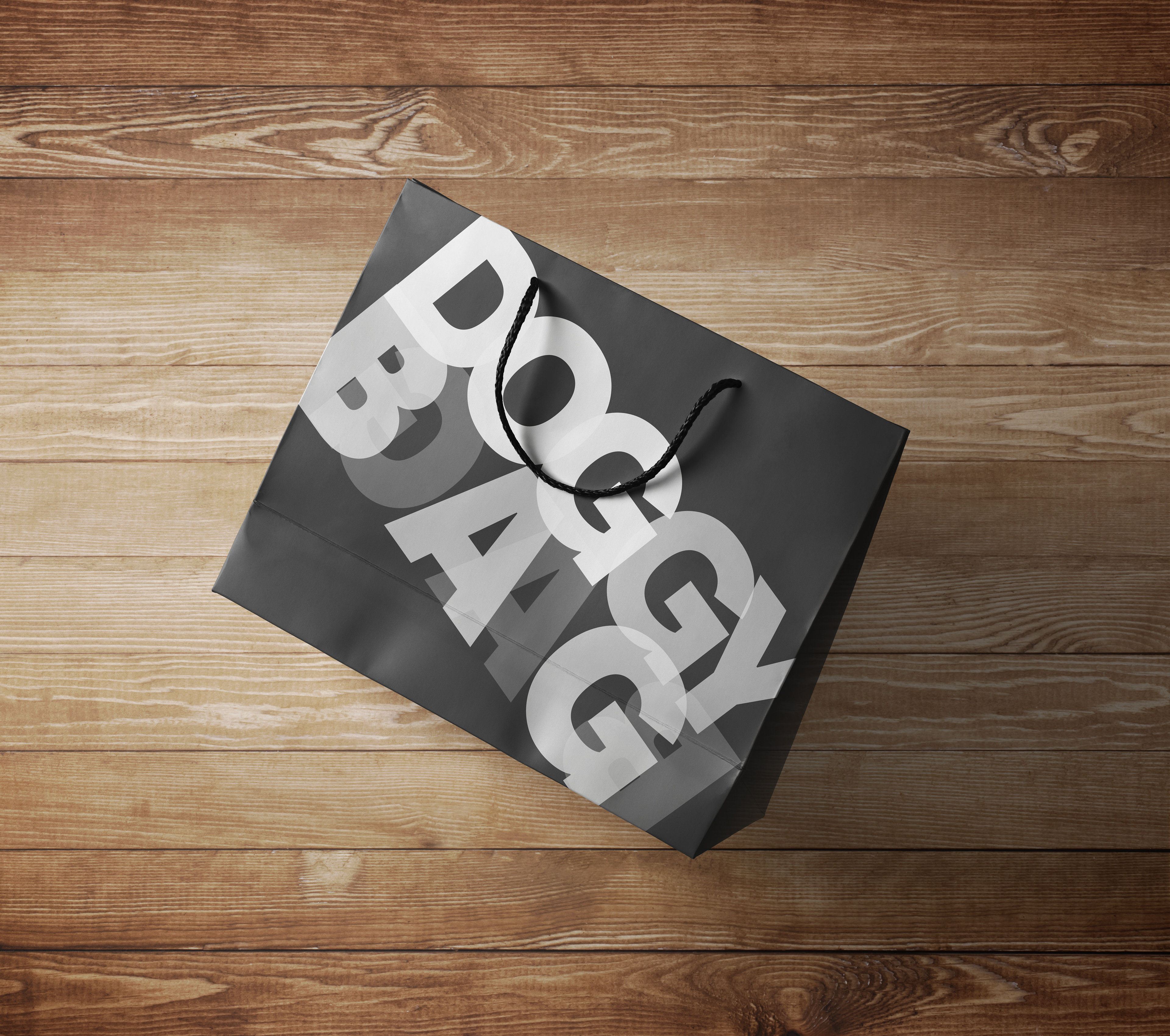
DOGGY BAG (or GAB)
Doogdoof's doggy bags are also punny for two reasons. Take-out bags are colloquially called "doggy bags" and the word "bag" is mirrored behind itself to read "gab". "Gab" can be synonymous with gibberish, a subtle nod toward the branding's concept.
#SOLVED
We did it—we branded a dog restaurant as an homage to them. We used the very ideals that make dogs, dogs to create a brand identity. We created a typographic system so complicated it paradoxically breaks all the rules of respectable typographic design, which is the key component in what makes this branding so unique and conceptually relevant. We’ve communicated to humans in such an unconventional way. We’ve created this larger than life restaurant, with big, chunky, slim, serifed, sans, type overlapping each letter, playful yet serious, which almost acts as the presence of dogs itself. However, its true purpose lies in its thought-out and multivalent concept. It’s a tribute to dogs’ multidimensional nature—to their intellect, their wit, their empathy. It reflects on their exuberant nature, yet their soft embrace. It uses the very aspects of what makes these beings so wonderful to communicate and to accommodate them.
AND REMEMBER...
The beautiful thing is, dogs don’t need fancy branding to be attracted to food. They don’t need specialty meats or treats to wag their tails after dinner. This is why we designed a restaurant for them—because, despite the fact that they don’t care about or need any of these things, these are the very reasons they deserve it. They love with everything they have and ask for little to nothing in return, just some water, nutrients, shelter and rubs, and that is what makes dogs, dogs. So, it’s about time we make good food for them.